Sunday, January 31, 2010

Animation Website Tips!

Following up on "Animation Portfolio Tips", here are my thoughts on animator websites.

This refers to individual animators looking to work for a studio, whether freelance or on staff.

Your website is an adjunct to your portfolio (and vice versa).  They might share some material, but just as the media are different the contents are different.

We make an effort to look at every website artists send to us.  We even try to respond -although that doesn't always happen.  As a point we won't respond to anyone who sends follow ups like "Hey!  Did you look at my stuff?  I sent you my stuff!".  That's a lot of hand holding for someone we don't even know.

One thing that's a major turn off to me, individual artists who present themselves as production companies.

This bugs me for a number of reasons.

1) we're not looking for subcontractors
2) we're not looking for a director
3) we're not interested in giving work to competition [despite what we may post/promote on this blog]
4) we're not happy with an inbetweener taking the finished piece and putting on their site as a Mynametoons Production.

On that last point, we encourage all our artists to keep and post copies of what they done.  We hope they're accurate in how they credit the work.  For instance, I'd be fine with an artist saying "They gave me a crappy storyboard and some questionable designs along with a quicktime that didn't work for timing and I made everything else because those people have no idea what they're doing." as long as that's an accurate description of the project.

That's what we don't like.  Here are some things we do like.

Let's use examples of two artists who's websites inspired us to meet them in the studio.

Abbey Luck referred Vanessa Appleby to us when they finished working together.  Referrals from friends/people we've worked with are always a plus.  Try to get one whenever contacting a company for work.


Here's what we liked about her site. It's been re-modeled since we first saw it, but the criticism still applies.

1)  The category pages make sense
2)  It contains a resumé that you don't have to download
3)  E-Mail & phone number easily visible
4)  Supplementary material -blog especially -is cogent
5)  It's functional
6) A clip reel is easily available in addition to a limited number of full films.
7) There's a bit of process work

That's enough to get someone to look at the work seriously.  This site also doesn't overload the viewer with too much information.  It's a complement to a reel and portfolio, not a substitute.

This site shows the artist's work, gives a sense of her strengths and weaknesses.

One thing I don't like: the "illustration" section.  These are drawings.  It's only illustration when it's "illustrating" a text.  Illustration is a commercial application of drawing.  It can also be a commercial application of painting, knitting, photography, sculpture, etc.   If they were associated with news or  children's stories they would be "illustration", if they're not call them "art" or "drawing" or something.

A young artist's "illustration" portfolio isn't all that interesting to most animation studios.  On a website, though, you need to show broader talents than animation so it's important to keep these others skills visible.

And here's another site.


Leah Shore happened to be a classmate of Ms. Appleby at RISD. Maybe they have a few good teachers there who help prepare them to be working artists.

She sent her links, including her thesis film. We thought they were great and asked her to stop by if she was ever in town.

Also, her email was titled "LEAH SHORE IS AWESOME!" While that may (or may not) be true, and I'm inclined towards the former -a subject header like that is more likely to be ignored than: "Leah Shore - animation portfolio". Not because of the unseemly boasting, but it reads like a new Nigerian scam or pornographic spam. Hoping for one of those options, we found it was an artist's letter instead.

Again, her site is simple. It gives you the information and works as a complement to an "artist sales package".

Both of these artists keep blogs. Blogs are a great component of the web aspect of the package. A website is largely static, they give a great sense of the creator but they're a pain to update. The artist's blog lets prospective clients/employers
know the artist is actively involved in perfecting the craft.

Next in this series, I'll talk about the sample reel/resume/cover letter. The last part will concern what to do on an interview.

Saturday, January 30, 2010

Arcs Are Everywhere - Animation Notes 7/7/89

Here are the notes from Tissa David's lecture on animation July 7, 1989.


WALK: Treadmill the moment the heel touches the ground it [the ground] moves back

Pendulum [illustration]

on 2's.  You skip #7 inbetween and expose 7 because the eye.  1 2 3 4 5 6  -

Do not use the original 7 but inbetween 6-7

[chart] Going back skip 3.  1_2_3_4_2_1.
Use inbetween or skip 3

If shoulder rises in walk that case arc should also rise.  If he is carrying case.

In planning out a film plan the whole picture at once in storyboard form.

The story should build up to a climax and provide satisfaction and purpose.

The plan your scenes cuts and don't use a stopwatch.

If you do have dialogue or narration it will automatically pace  your film.

Make out your exposure sheets and scenes.  15 sec - 5 sheets

When you plan your scenes don't use long shots unless you have a reason


Cuts should have meaning and practical

you exposure sheets should be absolutely clear so assistants, cameramen and editors can understand your picture.

Animation is acting.

Anyone can move a character or things, but acting brings life.
Don't over act or overanimate.  Exaggerating an action is overanimating.  If you are exaggerating an action or motion for a purpose, don't jump all over the place.

Best animation is a direct action.  Always think of how the character feels and then animate.

Don't animate 2 things (action) at once.
If there are many characters they should be reacting to the main action.

Timing: if there is a dialogue it automatically takes care of the timing.

[illustration]


Walking: the head moves forward or tilts

[illustration]

Every frame the character should be in balance.

Shoulder and pelvis counterbalance.

[illustration]


Above: Animating Tap Dance Tips


Friday, January 29, 2010

The World In Motion

In a Saints inspired drunken reverie, my high school friend Christine Horn sent this link all the way from New Orleans!


It's obviously motion capture, but neither the technique nor the design (which is pretty good) are what I find interesting.   And yes, it is a few years old.

It was displayed in loops at Issey Miyake boutiques.

Fran Krause made a remark on a panel at Ottawa about abstract film. He was at his parents house when the screensaver popped on their computer. "It's like Stan Brakhage or Norman McLaren!"

In a way yes. Graphically, the liberties won by abstract art and animation have pervaded culture.

In essence, not really. At its simplest (and generally speaking) abstraction in animation asks you to observe. Most instances of industrial animation or animation in architecture are meant to be unseen. To be wallpaper for the 21st Century.

 
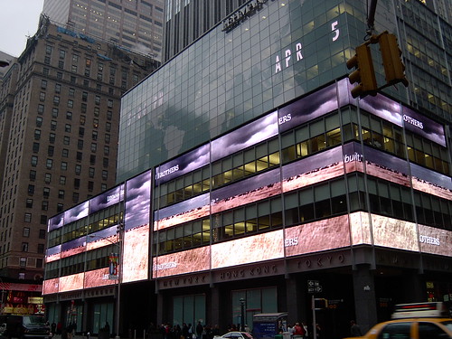
Lehman Brothers Building, 48th Street and Broadway
The Miyake graphics serve as both a moving wallpaper and an exploration of design and motion.  Abstraction integrated into our expensive shopping sprees.

Thursday, January 28, 2010

Grey Abstract

This painting reminds me of an LP.  That a record for you youngsters.  It's how really old people used to listen to music before the iPods.  Before the compact disks even.

It's called Grey Abstract and Fred Mogubgub painted it in 1982.


His work begins to explore geometry around this time.  His animation the "L'Histoire du Soldat" is the animated result of this, but the study is furthered in his paintings.

It's been made a gift to Ian Marshall who's love of 60s pop films is exceeded only by his love for record collecting (and cats).


Wednesday, January 27, 2010

History: Howard Zinn 1923-2010


Illustration by Mike Konopacki from the comic book adaptation of Howard Zinn's "People's History of the American Empire"


Brian's an admirer of Howard Zinn's work. He even received a letter back from him after pursuing a possible, vague collaboration.

The world has gained much from his life, and lost a lot in his passing.

State Of The Union -2/11/44

Cordell Barker has put up a "blog" or two from Sundance. His "Runaway Train" is playing there.

How will the Liberal elite of Hollywood react to its rustic charm from the Great White North?


*******************


Politics aside, here's The Animator from February 11, 1944.


Note how Warner Bros. is referred to as Schlesinger's. We've come to call all the Merrie Melodys by their distributor's name. Warner's didn't buy out Leon until later in 1944.

Issues on page one. Six days of holiday per year/per contract. Overtime and out-of-town pay at Disney. A vacation issue with MGM. Sick leave at Schlesinger. Over-minimums at Screen Gems going before the War Labor Board. Lantz- Nothing. Retroactive wage increases at Wolff. Job reclassifications at Pal. Bunin, meeting on new contract. Plastic [I don't know plastic]: "This studio is just getting started, there has only been one minor case there."

Then some news of marriages and GI visits.


Back page concerns national labor events -the AFL advising that returning veterans have initiation fees waived (or even paid one month dues). Two deaths are noted, both women. One, Eddie Alvarado, on service in the South Pacific.

Tuesday, January 26, 2010

The Horror! The Horror!

Our friend Steve Kerper forwarded us this trailer which was produced at Laika.


Steve has partnered with the film's producer, Bernie Goldmann on a few projects.

Bernie, who was a producer on "300", initially questioned whether animation was a viable technique for a horror film.

Casting aside the obvious shortcomings of the trailer (the second year Maya student camera work, why are two people sitting in a giant empty space when monsters are hunting them?, how much good will that crowbar do if she's not changing tires?) the question of "appropriate technique" is a good one.


There have been a few feature length animated films to touch on horror. Most notably Satoshi Kon's "Perfect Blue" and the Japanese classic "Vampire Hunter D". The French anthology "Fear of Dark" comes close too. These offer more cerebral scares than the classics of the genre not even approaching the primal fear conjured by "Night of the Living Dead" or "Halloween". Even the psychological terror of films like "Rosemary's Baby" and "Repulsion" is leagues beyond any attempts with animation.


The horror film's power comes from psychology. It comes from the viewer's identification with the actor/character and the subsequent stirring of pity and fear in the viewer.

Animation inherently alienates the viewer from the film -the barriers against that same identification are too high.

Monday, January 25, 2010

Starting Up The Publicity Train

Last year PBS put a gigantic promotional effort behind "Make 'Em Laugh".  While our work on that was extensive, it was essentially indistinct.  We did a few nice sequences, but most of it was standard documentary graphics.

This year, "The Buddha" is set for similar treatment.  This film is 1/3 the length (one night, two hours) but our work is, well not central, it does set a unique tone for the film.


Two weeks ago was the press junket for the Winter/Spring 2010, and PBS has begun to release web promos of the film (which was just mixed and titled last week).

Here's the official PBS website.  It will get more complex in the upcoming weeks, with more clips and artwork added.  Currently it contains an animation-free trailer.  The design of the page incorporates some of our work.

Already up are a Facebook group.
And a Twitter account


We've been thinking a lot recently about these things -"social media" to use a loathsome  buzz term.  With our work on Infor, we've seen first hand how these things can expand "awareness of a brand".  Of course, Infor has a million dollar ad campaign with an international network of agencies and media buys -but their market is bigger too.

"The Buddha" is a broadcast program, it also a vast target market.

Animation, graphics, design, editorial -the work we do -the market for that is significantly smaller.  Still, maintaining a website, a blog, a twitter stream, etc. is significantly less expensive than running ads in trade magazines.  The trick is to make it as effective.

Even though we're in the business of making pictures, in order to keep doing that, publicizing them is a full time job.

Sunday, January 24, 2010

Other People's Junk


These are a bunch of black and white glossies from the flea market.

Most look like press photos (remember when magazines not only existed, but published photos in black and white) or other promotional material.


Dick Tracy promoting the "Watchman".  A few years after Sony produced the Walkman, the Watchman was released.  iPhone doesn't seem so cutting edge now, does it?


Wazzzzuppp!??!?! Doc.

From the looks of it Bugs Bunny is inviting the Trix Rabbit over with promise of cereal.  Most likely a devious subterfuge.


 These are some Blondie and Dagwood puppets.  No idea what its for.


 McGruff, the Crime Dog.

Strange pose to use for publicity.  I can only imagine what the unused frames looked like.


The ugly things were ubiquitous 25 years ago.  Say what you will about the California Raisins, they had more soul than Coraline.

Saturday, January 23, 2010

Animation Portfolio Tips

I saw this article yesterday.  "Animation Portfolio Tips".

I won't go into the specifics of the article -there aren't many, anyway.  But will put forward my thoughts on the matter.

As a preamble, know who you're targeting.  Don't waste anyone's time by going to a medical animation company with your stop motion feature.  Sure, there's always a chance they'll need you but there's a greater chance that someone who does stop motion will be hiring.  Resources are limited, spend your energy where it has the best chance of reward.

Personally, I've never had to put together a portfolio, it's not really in line with the work I do.  I have made plenty of sample reels. 

More importantly, I've seen a lot of portfolios and I know what I like.  That's one thing to always keep in mind: everyone you meet will have different preferences.  There's no cookie cutter method for building a portfolio, what you can do is cater yours to showcase your strengths as an artist.

I'm mostly interested in work from 2D/drawn animators, I'm a little out of my element discussing CG work, although people send me their reels all the time.  We'll ignore traditional 3D and focus on the drawn portfolio.


Drawing from live model is the most important element of an animator's portfolio. 

I like to see a few pages of 5 minute drawings, a page or two of 10 minute poses and a few pages of 1 minute drawings.  Each shows a different skill.  The quick drawings are about gesture -seeing where the weight lands.  The 5 minutes start to show draughting skill and expression.  Longer drawings demonstrate dimension, light and shadow and illustrative detail.

A animator's portfolio without life drawing is worthless.

Example: We have a box of portfolios.  I just flipped through a few.  Most were comprised solely of the artist's own designs.  Some were very good.  But the odds of anyone hiring you to animate your own designs are astronomically low.  No one wants you to draw like you -an animation artist needs to draw like somebody else.


That's why it's a good idea -and I never ever see this -to do poses of known characters.  Or better yet, Chas. Addams drawings or Roz Chast or Steven Appleby.  Demonstrate that you can make any style move.

After saying, "don't fill the book with your own designs" I'll say "have a few pages of your own design work".  Not a lot, a few.  This will showcase not only your drawing skill, but who you are as a person.

Now here comes the tricky part of a portfolio: showing animation.

I've had people show me a stack of drawings.  That's a waste -I can't see that in a pencil test. Showing your drawings as an animator is interesting and important.  I would recommend exhibiting them in the manner they were created and no more than 10.  Take a walk for example.  Put your keys in first, followed by the breakdowns, followed by the inbetweens.  Then the clean ups.

If you're a novice -and I've never seen this, although I would love it -take someone else's keys (properly attributed) and show how you inbetweened them.  That would be great.

Things often included that I [generally] don't care about: storyboards, pitch bibles, logo designs, childrens' book samples, photoshop collages.

I don't care about storyboards because there are three dozen artists who I trust to do boards.  You're not getting hired for it.

Things that are tangential that are of interest: paintings, screen grabs from AfterEffects, exposure sheets, letters of reference, list of course work.

I could go on for another few pages, but will stop short here.  In the future, we'll post about sample reel presentation and then maybe another about giving an interview.

Friday, January 22, 2010

ZIP IT!

When I think of the 1980s -this is the first that comes to my mind.


The Morton Downey Jr Show. It was trashy, outrageous, and full of skinheads, red-baiting, wrestlers, rockers, charlatans.


What struck me most as a kid -and sticks with me decades later -was the opening.

Photo animation created by the great Veronika Soul.


By the time I entered the animation industry, the blue airbrushed background card was on its way out.  But it was a staple of 1980s commercial productions.


Morton Downey Jr. may have been the last guy to smoke on TV, but that didn't make him hate Fidel Castro any less!

Thursday, January 21, 2010

From Here To There

Seems like everybody hates Flash.

A few people don't.  Fran Krause, Nina Paley -but lets face it, they're just weird.

While I personally have a hard time with the program (it's minor interface peculiarities are major problems for me), we use it at the studio with some regularity.

Not all of the time, or even as a default.  Most studios currently "think with Flash".  They look for the answers to a potential film's questions principally in the program.

Sometimes it's just easier than drawing on paper.

In this project (currently in production), we've done the animation as though it's on paper.

Liesje Kraai created most of the keys, some rough, some cleaned up.  Christina Riley takes it from from there, cleaning up in-betweening and filling keys for shots with only storyboard layouts.


Most important, we're offered a great crutch with Flash.  The whole piece, about two minutes, is lip synched in Khmer.  No one here speaks the language.  Of course it's possible to animate in a strange language, just follow the standard process and work closely with a translation.

Here you import the audio and work directly with it.  In this case, we have great reference footage from which we're "stealing" the lip synch.

The trick is to get something to look good.  That's where the art production comes in.  For this, we wouldn't do it in Flash.

Everything gets exported as PNG sequences and painted in Photoshop.

Hopefully they'll all look like this.


Wednesday, January 20, 2010

Labor Issues

First, congratulations to Patrick and Kate Hambrecht who brought Luther Hambrecht into the world early yesterday morning.

Kate remains the only personal friend to have given me work -a short lived advice column for Jane Magazine.

*************

Several months back, Ed Smith gave me a stack of union newsletters from the 40's and 50's.

There's a near complete run of the East Coast newsletter from the first issue up to the mid-50s.  Those are in fair condition.

He also gave a stack of newsletters from Screen Cartoonists Local 852, Hollywood.  These start 1/17/44 (Vol 2., No. 71).  They're extremely fragile and in an effort to preserve them, we'll be posting them occasionally.  A cursory search hasn't found them in any online archive.

We'll do our best to keep these chronological.  The originals are in rough shape, so its likely that some will fall out of line.  For those interested we're creating a "union newsletter" label which will sort only these.

A slight correction is applied to reduce the discoloration in the paper.


click on any image to enlarge

The first page and a half are comprised of a letter from Anthony G. O'Rourke, Executive Secretary of the Animated Film Producers Association to the Union, stating complaints about slowdowns at MGM in the Assistant Animation and Ink & Paint departments.  It goes on to accuse the Union misrepresenting and "slurring" the Producers.    It ends with a "request [for an] indication of the board's consideration of the situation and a statement as to the future practices of the Guild..." Ultimately pointing out that the Producers don't have these problems with other guilds.


page two

As an author many angry business letters, I will say the AFPA drafted a good one.  It sets up the standard which they expect, lays out the complaint, asks the party to suggest a solution -all while being firmly (but not emotionally) pissed off.  The way the letter is phrase allows only one response to it's logic.

The Guild does not agree with the Producer's starting point, despite the logic of the letter -the contents are in dispute.

They go on to address the letter point by point.


The first "work slowdown" issue relates to assistant animators.  The Guild expected their work to be recognized on complexity, MGM pooled it all together.  The example: "Greater credit was given for the creation of the 'Seven Dwarfs Dance with Snow White' scene, than for the depiction of puffs of smoke coming from some toy engine".


The Ink & Paint issue is more interesting.  We'll quote in full:

When that dispute was first called to the attention of the Guild, its Business Agent met with the representatives of MGM.  Investigation revealed that for sometime an MGM official had been promising over-scale increases to at least nine girls, who were admittedly deserving of them.  But, notwithstanding such continued promises, none of the girls received their increases.  When, in their despair, the girls violated company rules, (and this they did out of exasperation occasioned by broken promises), the studio elected to discharge five of the employees.  These discharges were not challenged by the Guild, although the contract gives it the right to challenge such discharges.  (See Article XV of agreement).

Finally, with respect to these grievances, may we remind you that one of the young ladies who had been so promised an increase, requested an availability certificate from MGM; this was refused and she lost the opportunity of obtaining better work elsewhere at higher pay.  Subsequently, this same girl obtained employment with the Air Corps, doing very important war work and MGM is even now appealing the decision of the War Manpower Commission which gave her an availability certificate.  Small wonder then that some of these young ladies felt- and still feel- considerable resentment toward the actions of this particular employer.

This situation is not resolved in this issue.

Tuesday, January 19, 2010

The More Things Change

The more things change.

In the olde days, the 20th Century, there was an electronic stock ticker whose red diodes read "HOW MANY TEXTS?". All day. All night. Inches above Pak Punjab on Second Avenue.


Today.  Blank slate.

Oddities are a quick casualty of the Sex-in-the-Citification of New York.  After the Giuliani scrub down, what was left but for the Bloomberg administration to usher in an epoch of shoe shoppers and condo developments?

A few blocks south of Pak Punjab, on the north side of East First, a lucky pedestrian at one time could have caught an unscheduled performance by "The Cat".

I don't know if that was an official name, that's what we all called him -"The Cat".  He'd stand in his window, strumming fuzzed out power chords while wearing a unitard and what appeared to be a sort of cat mask.  From his feet psychedelic swirls projected onto him, blurring his features and gestures in a wave of color. 


Today, The Cat's cave is a real estate broker.

Just down the street was one of my favorite urban pieces of art.  On the Lindsay Gate of "Abbetta" a sad sack rendition of Bart Simpson with a welding mask and torch, a word balloon exclaiming "Boiler Man, Dude!"

I don't know what it meant.

Today that garage has been turned into a fancy bistro.


Abbetta has kept it's adjacent garage, albeit with less memorable art.


Note the phone number: GR5 et cetera.  That's "GReenwich-5" for you youngsters.

My childhood exchange in Philadelphia was DE-8.  That stood for DEvonshire.  I doubt many people under 35 would have even heard of such a concept.

Monday, January 18, 2010

Treadmill Walk

Here are notes from Tissa David's animation class of 6/15/89. They are not old enough to buy alcohol, but voted in the last election.

I believe they cast a ballot for Ron Paul.

A lot of what is contained is outmoded -to an extent anyway.

Certain principals of drawn animation are inalienable. Some nomenclature, some process is technology driven. As the work of an animator has a large technical component, its only natural that some aspects of animation study go out of style.

Other aspects are eternal.


Space determines speed of background
Pan Right Top Pegs
Treadmill bottom pegs foot stays so...
that the foot does not slide

[illustration]

Animation on twos, BG should move on 2's

Avoid straight lines because line will strobe on 2's.

Exposure sheets
80 frame 96 frame
16 frame = 1 foot of film

On 2's 2 frames per drawing is safe
On 3's 3 frames still safe [looks like it reads 'soft']
If spacing is small and fast then animate on 1's

For levels 4/D 3/C 2/B 1/A

Half hour film: SEQ A B C D E

Avoid long scene. Introduce close up to break monotony.

Truck is camera moving
Pan is table moving


Cut into scene and fast zoom
In. slow down
1/100" a very slow speed/every second frame (very slow hardly moving)

In moving BG on 1s and animation on 2s it will slide or strobe
when character is animating forward (and not treadmill)
It must be on ones

1/1o" BG

Tree foreground 2/10" speed
speed will be determined by the characters step - space.  Fast. Slow.

Sunday, January 17, 2010

1/17/09

My father would have turned 58 today.


Happy birthday, in memorium.


We're all racing to the finish line.


Thanks to Hazel for sending these photos.

Saturday, January 16, 2010

See This! Somehow!

First order of business.

We've decided to start using our Twitter account. twitter.com/asteriskpix

Not exactly sure how yet, since animation is a pretty stationary profession. Probably just "breaking news" like when films screen or shows or broadcast. Maybe some winning one-liners from around the studio such "Stupid kid, there's no such thing as a penguin version of Candyland."

We figure it puts us in position for a profile the next time someone wants to do a media story on social networking.


***********


On Sunday, Kristin Worrall took me to see "Flooding with Love for the Kid" at Anthology Film Archives.


Apart from the sound effects she contributed -usually via email conversations "I need the sound of crawling in bat shit on the floor of a cave." -the entire piece was singlehandedly made by Zachary Oberzan. I guess the men and women who built the equipment and wrote the software helped in their own way too.

And the guys who constructed his 220 square foot apartment.

The film is an adaptation of "First Blood" -the novel which also spawned the Stallone "Rambo" series.

Nina Paley was amongst the first people to whom I recommended the film. The DIYness is analogous to "Sita Sings The Blues", although significantly less polished. She didn't hate it, in fact, she wrote a nice little blog post which reminded me that I wanted to do the same.

Here's a "making of" video:


So in my blogging laziness, the run at Anthology has ended.

Copies are available from Zach himself.

"I like to funny drawings", you say, "What does this guy taping around naked in his apartment have to do with me?!?" Legitimate question.

In the above "interview" -and obvious in the movie itself- he talks about how in his first short films he aimed for slickness. For professional perfection. Here, he says, he was having so much fun that perfection wasn't a goal. The joy is apparent.

In using minimal tools and resources, he make a connection to the character of Rambo who also had no resources beyond his own ingenuity. He created a language of filmmaking to match and elevate the content.

Its a brilliant example of what Richard Williams calls "sophisticated use of the basics".

************

Speaking of Nina, she stars in this short documentary on Intellectual Property. Bill Plympton is makes an appearance to briefly give another point of view.

The Revolution Will Be Animated from Marine Lormant Sebag on Vimeo.


I don't hold her militant position, but I do think that American Copyright law needs some serious reform.

Thursday, January 14, 2010

Virginia's Garden (details)


When I visited Fred Mogubgub Jr. in his high rise apartment by the airport during the summer of 2002 he had his father's paintings stashed everywhere.

They were behind the refrigerator, in every closet, under the drop ceiling.


Dispersed amongst these canvases were the fragmented pieces of "Virginia's Garden", a painting which was planned to hang in the World Trade Center.  Upon completion it was over 750 square feet.  A curatorial change at the World Trade Center scuttled  the exhibition there.

The New York Times claimed it amongst the world's largest paintings.  Mogubgub claimed it as the biggest.

Fred Jr. had it dissected and rolled up in scattered corners.  More, he said, was in storage in New Jersey.

In addition to tomatoes and zucchinis, there are portraits of the artist's children, tarot inspired symbology and other cosmic iconography.


I only manage to snap a few images on my Pentax K-1000.  They hint at what a complex layering the painting must have been.


Wednesday, January 13, 2010

Tomorrow's News Tonight

PBS is announcing a new public affairs show to replace Bill Moyer's Journal.

Here's the story on The New York Times.

We worked with WNET to develop the pitch, a short film which explains what the show, called "Need To Know", is all about.


We're hoping to continue to contribute regular pieces to the show.

This one was shot in our studio, then edited over the next two days while we worked out the graphics.

Tuesday, January 12, 2010

Passing Greats

I didn't mention David Levine's passing last week.

It's hardly an exaggeration to claim that he may stand as the greatest American caricaturist.  Sure, he was no Daumier, his jabs could be sharp but they were rarely visceral.   Politics in America, they're nothing like the Second Empire.  Revolutionary? Forget it!


David Levine's work represented what our society could be -literary, witty, inventive.


Last year also saw the passing of another great, John Updike.  Updike was inspired by James Thurber and as a  young man wanted to be a cartoonist.  Maybe even an animator for Disney.

I was introduced to Updike's work in Sophomore year of high school with his short story "A&P".  That summer and the next few years I read everything I could of his.  "Rabbit at Rest" hit the shelves right around this time, I found out first in a headline on "The New York Review of Books".  Surely illustrated by David Levine.  I would have had no idea who that was.  At the time I dreamt of becoming John Updike.  Who would have guessed this path to animation?

Twice I met David Levine.  The first time was at The Ink Tank.  R. O. Blechman was on the board of the Swann Foundation and offered our space for its yearly grant review meeting.  Also on the board were Ed Sorel, Art Spiegelman  and a few academics.  And David Levine.

While bringing in water, I mentioned to him that I would go to a Chinese restaurant in Brooklyn Heights decorated with his work.  He was immediately engaging.  "Really?"  "Are you an artist too?"  "Do you live in the neighborhood?" No, my then-girlfriend did.  "You should stop by sometime!"  "She's an artist, tell her to come over!" et c., et c. with all the kindness and warmth of an old friend.

We didn't take up his offer for a studio visit.  A few months later we stopped eating at the restaurant.  They redecorated and the food had always been awful.

I never got to meet John Updike, although I considered calling him up on occasion just to introduce myself and say hello. I don't know if he ever got to work in animation.  His writing was probably deemed "too mature".  That's a great shame, I imagine it would have given him an immense thrill to have seen his words come to life the way he dreamed as a child.


Monday, January 11, 2010

A Glimpse Of The Future

As traditional television advertising continues its death rattles (Pepsi's recent dropping its ads from the Super Bowl yet another high profile example), agencies search ways to remain relevant (and in business).

"What does this have to me?" You might ask, "I just like cartoons!"

Since the birth of television advertising has supported not only broadcast shows -The Flintstones, Rocky &; Bullwinkle, etc. -commercials have fostered technical innovations within the medium and supported smaller production companies.


In some ways, the fall of the monolithic commercial can help the animator. Sure, those quarter-million dollar budgets would be great -but how many of those have we seen recently?

What we have seen is a proliferation of smaller budgets and more modest productions. Online technology presents a plethora of creative challenges (bandwidth and delivery platforms, foremost) but these will improve. In the meantime, there is the opportunity to take part in "integrated" campaigns in a way the :30 spot didn't allow. 

Here, a writer discusses Infor's "Down With Big Erp" campaign. Steve Brodner created the illustrations and we worked with him and PJA Advertising to bring these to the web and to "animated" billboards in airports.

The web components include, flash banners in targeted publications like the The New York Times, Barron's and The Wall Street Journal, "rich media" ads which run before sponsored content on media sites, and a "microsite".

Other "social media" include character accounts on Twitter, and homemade employee videos.


This is a big and expensive advertising campaign, but the size and costs are spread over a longer period, various incarnations and lots of peculiar things.  Further business is created for animators from the borderless nature of the web, as each market may require a tailored delivery.  In developing and organizing this, PJA has shown the value of an advertising in the post-TV age. The breadth of the campaign and the agency's trust of Steve Brodner (and, in turn, their trust of the animation production company) will hopefully stand as an example how commercial animation and commercial illustration can thrive for another 50 years.