Probably around two years ago I was walking down 7th Avenue to the subway and a street vendor's table caught my eye.
I didn't stop, for fear of getting wrangled into an attempted hustle (even if I want something, the moment someone tries to "sell" me on it I resist). Instead I did the "turn and look".
He was selling "original" paintings. Most were small: 3 x 5, 4 x 4. Most were loose images of superheros: Spiderman, Batman.
There were a few that were particularly peculiar; little recreations of Ivan Brunetti panels.
Too shocked to stop, too mystified I passed by. The rest of the day I kicked myself. I should've stopped. I should take pictures and send them to Brunetti.
The next day the vendor was still there. I laid down $20 and didn't say a word.
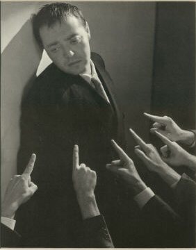
$9.99 is well-directed and well-written. Like last year's Waltz with Bashir it uses animation to market an otherwise ordinary story (like Waltz with Bashir it also claims Israeli financing; good to see the US tax dollar put to work beyond bailing out billionaires). And, as true in Waltz with Bashir, animation ultimately handicaps and stunts the impact of the film.
It's a story about humans. A story about humans, yet the production techinique is de-humanizing and alienating. The fact that we're looking at puppets, fingerprinty foam latex puppets is foremost in every frame. The story demands emotional performance, sympathy which the technique simply cannot provide.
There's one emotional connection, it occurs with the inanimate piggy bank. Significant, I believe, of the strength of the writing and the failure of the technique.
In Knowing, a cypher predicts the future. We 'know' what's going to happen, it's carried out, and yet it's still surprising. In fact, the execution of the prophecies is more surprising to a contemporary film audience that their aversion. More than surprising, the special effects wizardry of the climax is downright fulfilling.
From the onset of the parallel narratives, there is an even greater feeling of inevitablity in $9.99. We 'know' all of these people will have instances of intersection which lead to a moment of grand redemption. The film sets this up 75 minutes but the grand moment -despite mighty straining from the soundtrack -doesn't payoff the long build.
The director, Tatia Rosenthal, said she worked with this technique because it was what she knew best and what was comfortable. That may have made it easier for her over the two years of production, but it was a disservice to the film. $9.99 is 'good' for animation, and those of us who feel the techniques of animation go beyond Broadway musicals for children -just as Waltz with Bashir created a stir. It is also a good signpost of what the technique's strong points are, and what happens when you remove the human connection from a human story.
If you're reading this you've either stumbled across it by mistake (googled "naked balls drawing" like at least one pervert has) or you spend too much time thinking about the nature of things -how and why they work.
I've admitted how "Cloudy with a Chance of Meatballs" was central to my formative years, and how my occassional work with Ron Barrett, it's author, has been a highlight of my maturing years. How I hope the film does well.
Passing this broadsheet at the cinema on Friday night, though, I wonder -not about the success of the film but whether I'll enjoy it.
Art is all about me. Unless you're you, of course, then it's all about you. It starts with whether I "like" it and ends with "insight".
Film? Film, in its essence is a storytelling form. The descendant of Tragedy by way of the Morality Play, Gotterdammerung, and George Eastman.
Motion pictures first experimented with sports films and moving portraiture (like the Lumiere productions), the medium gained its form once narrative became the focus.
Later innovations only served to advance the fundamental goals of storytelling -synchronized sound, color, steadicams, CG effects. These innovations all served to detail the space of the film. Like its predecessors, film lives in a defined space. The theater exists (primarily) behind the proscenium, the snapshot on a flat plain, a symphony is performed on an array of woodwinds and strings.
The film's space is the screen.
One hundred years from now people will look back on today's experiments in 3D just as we look at nickelodeons and zooetropes -primitive attempts to express the power of an art form yet to be born.
The content of this piece is remarkable. Smart. Funny. The form isn't there yet, you have to scroll down a long page like reading an olde tyme edict or Roman conscription.
The art is alive, the writing and observations are moving -ironically the presentation is placid.
Perhaps its an example of "old" media, newspapers, trying to adapt to new media. The New York Times, though, thinks it can make this new fit into its own preconceptions -too stubborn to realize its perspective and presentation are rapidly becoming antique.
Its a great exhibit space, two long walls. Solid New Deal marble. Ceiling until tomorrow. And highly trafficked by accountants, lawyers, architects, seamstresses and whoever else clocks in their 9 to 5 in this building.
Its an exhibition space which suits the nature of the work. Its clean and clear, and you get it very quickly. The form is purely functional, but there's a little something to make it pleasing.
I'll make the claim that last night's opening was kick off of animation's Spring social season. I don't know of any other events on the social calender, but this made a nice start.
One session of my course at Parsons is dedicated to Brecht's "Notes on the Opera Mahagonny".
I wonder how the students take it when I say things like "everybody back then was a Commie." Do they know what that means? What that would have meant culturally twenty years ago? Eighty years ago?
Brecht's thinking, which we'll sum up as "verfremdungseffekt" in order to incorporate the three major parts of his philosophy (story structure, production/direction, performance) has particular resonance for animators.
I'll write more exhaustively about this in future.
For now, a brief bit: one student asked what "man as changeable" meant. I explained with two example from Brecht's work.
The clearer is the scene from "Life of Galileo" (with Charles Laughton as collaborator) in which Barberini, originally Galileo's defender, becomes convinced that he must be arrested. Throughout the scene Barberini is being outfitted as Pope, when the final piece of costume is placed his resolution is firm.
The other scene is from "Mann ist Mann". Gaily Gay gives his own eulogy, convinced that the he is someone else. This was a part originally played by Peter Lorre.
"You all know Peter Lorre, right?" Of course not.
Coincidentally, this class was on the same day as John Canemaker's Chuck Jones documentary kicked off an evening of classic animation on TCM.
Unfortunately, the Jones' directed "Hair-Raising Hare" was not part of the bill.
looking for a video clip from "Hare-Raising Hare" I found this:
Peter Lorre on "What's My Line?" pimping "Scent of Mystery" in Odorama.
Fascists drove him from his homeland, Hollywood drove him to the needle.
Here's a poem Brecht wrote after Lorre and his struggle to make it in Hollywood:
"The Swamp"
I saw many friends
And the friend I loved most
Among them helplessly sunk
Into the swamp.
I pass by daily.
And a drowning was not over in a single morning.
This made it more terrible.
And the memory of our long talks about the swamp
Which already held so many powerless.
Now I watched him leaning back
Covered with leeches in the shimmering,
softly moving slime
Upon the sinking face
The ghastly blissful smile.
"Scent of Mystery" also has a mark in animation history.
The opening short was also in Odorama. "Old Whiff", directed by John Hubley. Ed Smith told me he did some animation on it, according to Michael Sporn, Tissa David said she and Grim Natwick worked on it as well. This may have been one Tissa's first jobs at Hubley, production would have been in 1959/60. They had just finished "Terror Faces Magoo" at UPA. Tissa didn't animate for Hubley until later in the 60s (that's another anecdote) and Natwick isn't credited on any of his independent films (to my knowledge). They did do commercials with Hubley all during the 60s, though. And obviously, John and Grim had a long working relationship prior.
This film is no longer extant.A few years back I emailed F. Gwynplaine MacIntyre who posted an online review. "Where did you see it?" I asked.
He's an extraordinarily friendly chap with mighty, mighty facial hair. (order his book) He had seen it in the private screening room of (Lord) Lew Grade. I believe the British impresario had purchased at least part of the Todd A-O company (inventors of Odorama), although I can't find anything online to confirm that.
In any event, that's the last known location of this Holy Grail. Lew Grade died in 1998. His nephew, Michael Grade, was his primary heir. Presumably, and hopefully, Hubley's film and scratch and sniff cards are safely locked in a secret vault deep below Buckingham Palace.
I did make a half-hearted effort to contact Sir Grade but forgot about it after two or three days.
Last week's ASIFA screenings ended with Don Hertzfeldt's I Am So Proud of You. I won't go into that film here, other than to say it's best quality is the emotional realness of the mom giving the son a daily note in his lunch "I am so proud of you." That emotional realism is traded for gags, but it touches a beautiful moment. That's what makes the work especially disappointing -it's not as clever as it thinks it is (further evidenced by its strong need for an editor).
The best thing I could say about it -and this is too kind -imagine if Joe Frank wrote an episode of "Family Guy".
Moments like these litter the sidewalks. All too rare in animation.
The design is part Pablo Ferro, part Stefan Sagmeister. In the entrance of the building at 2 W. 13th Street, this is just the sort of thing that art schools (and animation studios) should have.
I recall a famous animator saying that his most important tool was an electric pencil sharpener.
Kate got this when she worked at Cosmopolitan in the 20th Century. It was actually Helen Gurley Brown's personal pencil sharpener. So there's more than even odds that fashion models have used it.
All important to note: every other pencil sharpener we have had has broken down -some within weeks -while this one still grinds the graphite.
Many of our friends and loved ones fight the same demons Dr. Hughes battled, the same curses that haunted his mother.
While he ultimately succumbed to his dark impulses, we are blessed- in the animation world especially, with the results of his life. However tangential they may seem, the events of our lives conspire to effect distant strangers in profound ways we will never know.
The early 1980s look like a tough time to have been British.
Punk burnt itself into New Wave, everybody loved Maggie and the animation -it looks like the Battle of London hitched up with Mutual Assured Destruction to produce two films which vie for "most depressing animated film ever".
Doing our bookkeeping this weekend, to get in the mood I finally watch the copy of The Plague Dogs which Christina lent me over a year ago.
She also lent When The Wind Blows at the same time. I watched that first. It's taken several months to recover from the morbid feeling.
When The Wind Blows was released in 1986, a feature length follow up to Raymond Briggs' widely acclaimed The Snowman. That film aimed to outdo the hopelessness of The Plague Dogs (released four years earlier) by showing two doddering codgers slide into a grueling death over an hour and fifteen minutes.
The Plague Dogs follows up Watership Down -the same creative and production team, this time with not a frame of input from John Hubley.
Two dogs wandering the countryside and slowly dying vs. two old people in their home slowly dying. It's hard to choose which is more inspiring.
The dogs are animated in a realistic fashion. That's probably the right choice, given the nature of the film -but that choice shackled the animation. We never connect with them, in part, because the animation is stiff and formal.
As I've written before, I'm a great admirer of how Ed Smith animates dogs. He has that rare ability to be anatomically precise, but still give life and character.
I wonder if better acting from the dogs would've made the film more enjoyable. If it would make for a stronger piece. I think so, now you cringe and look away that the painful scenes (most of the film), with sensitive animation we'd be drawn in -unable to look away.
We talk about what animation can be -"documentary", adult, personal. How films that use animation techniques can express the same depths as live action. These British films are strong plays at mature storytelling. Ultimately, they reveal more about their own culture and times than any great universal truth. That, in itself, is noteworthy.
Will today's spate of "mature" features -Persepolis, Waltz With Bashir, Mary and Max and on and on -represent a new age of intelligent storytelling using single frame technique or will they come to be seen as a byproduct of an era which prized novelty at a time when economics made animation a viable gimmick?
The Jetsons was clearly Hanna-Barbera's most stylish major production. Sure, that's like being the tallest midget...
The show also had a couple great musical sequences.
Another take:
My favorite Saturday Morning song, however, comes from The Flintstones:
Yeah, the animation on this stuff is terrible and the design is nothing to write your mom about but it has an appeal. Why is that? Is it simply The Honeymooners effect?
Is it because we recognize ourselves in these characters in the same way our ancestors saw their own daily struggles paralleled in the stories of heroes and gods?
A little while ago we got a call from one our favorite "kids" t.v. producers. We'd worked with him and his writing partner a few times and have always gotten along well.
They had a pitch meeting with a very big entertainment conglomerate which went something like this:
Creator: We have this great idea. It's a show with funny animals.
Conglomerate: Uh. We don't do that. What else have you got.
Creator: Uhh. [pulling something out of his hat] We've got this show about a shy teenaged girl whose PDA makes a cool outgoing version of her.
Conglomerate: Interesting. Get us a script and designs.
It was a "tween" idea, we trusted the writers and they trusted us to come up with the right design.
As I've mentioned before, we've always wanted to work with Maurice Vellekoop, he's like a sexier, gayer, less Scientologist Beck so this teen girl project was truly a perfect fit.
We set to work on the design. And really, I don't mean to brag, but it was perfect. Everything about it was 100% right.
Enter "The Legal Department". They wanted to pay us less than CTW would have paid in 1995 for significantly less work and "own" the resulting work. I pointed out that their rate was far below market value, but we'd accept it as long as we could negotiate other terms (right of refusal on production, ownership of original art, etc.).
Their response: "We don't negotiate."
Flabbergasted, I said, "You're a contract attorney -your job description begins with the word 'negotiate' followed by 'contracts'".
So eventually I said, "Well, send us the deal -we'll take a look at it and get back to."
Pissant paralegal pulling down $250k a year in LA says, "We can't send you the contract until you agree to the terms."
At this point, all of my politeness was worn down. "Are you running some sort of telemarketing scam? This is absurd... I've never... blah, blah, blah."
After that I wasn't allowed to talk to the lawyer. Who I don't even think was really a lawyer. If she was, she should be disbarred. Rude stupidity may not be a crime, but it has no place in our legal system.
At this point I was will to drop the whole thing. Despite our affection for the creators, without any promise of production or stake in the character the pittance we would get paid was not worth the time it took to receive the insult.
But we put it to a vote within the studio, and it was decided we take our chances.
Of course, they gave us a needlessly hard time about the design. Not the art direction, they signed off on the approach first thing. But every step of the way they stupidly micro-managed.
An aside: I accept that clients will sometimes tell me how to make films, that the advertising account executive gets input and the babysitter of the network executive will have a say. Grin and bear it. But telling Maurice Vellekoop how to paint? How to draw cool teenagers? That kind of thing drives me nuts. As a producer, I feel as though it's my job to protect artists from this sort of vain idiocy.
In any event, the big decision day comes up. The creators give us a call: "They're going to pass. They told us they're only picking up shows that feature animal characters."
It took me a year to pick up Unfiltered: The Complete Ralph Bakshi by Jon M. Gibson and Chris McDonnell. Not from lack of interest, its been on the very short "want" list since its release. Until now, we hadn't been fated to meet.
I'm unsure about Bakshi. Heavy Traffic is one of the great works of feature animation -a personal favorite, Coonskin is good -but not as good the chatter says it is, most of all HE GETS IT DONE. Many animation directors will let "the man" and their own neuroses prevent their films from crossing the finish line. Not Bakshi, he gets it done.
On the other hand, I just don't know. The art direction rubs me wrong, I guess. But I always hope to have that transcendant moment in his films -like in Paul Fierlinger's Drawn From Memory, or Sita Sings the Blues. The moment comes close but never arrives.
The book is very nice. Professional. Competent.
Swap out the pictures and you could easily have a coffee table John Lassetter or Brad Bird book.
Bakshi's work unquestionably deserves the highest treatment, but I have to admit -the book, its a little disappointing. Reverant, polished -two things its subject has never been.
A few spreads like this are amongst the graphic highlights
Stranger still the author tries to take on the tone of Bakshi, throwing around "balls" like it's Spring Training. One ill-conceived foray into expressive voice incongruously name drops Henry Rollins. The attempts to take on Bakshi voice are cringeworthy, but point a greater problem. This is a book of adulation (deservedly so, as Ralph Bakshi is at least the Teddy Roosevelt of American animation's Rushmore), but the artist demands more than adulation -his work deserves critique.
Bakshi's films should get the same type of serious treatment his 1970s cohorts have gotten. Coppola, Lucas and Scorsese have dozens of volumes dedicated to the study of their work -Bakshi's achievements trump them all yet this volume is the only book dedicated to him.
As complaints that is unfair -it's a good book, worth twice its price, and I don't know how I would have packaged it better. As criticism, though, I see a missed opportunity. This could have been the Illusion of Life for the independent animator.
More than anything, this volume makes you crave a "Complete Bakshi" DVD collection. Something like the Kubrick Collection would be appropriate. He has a few titles I've never seen (Hey Good Lookin' -just ordered on VHS) and some that are degenerated dubs of dubs (Coonskin, Fritz the Cat).
*************
We never got to meet Natasha Richardson, but we did share screen time with her:
James Ivory was a pleasure to work with. Even though he wasn't familiar with the animation process, he has a great eye. The producer, Ismail Merchant, died during production so we never got to meet him either and we never got to enjoy one of his legendary dinners.
The only direction we got was "Linnell sees tug boats". That was the most specific we've gotten on any of the projects we've done with They Might Be Giants.
Usually, they'd send a track, we'd get on the phone and throw around some ideas and then come back with a refined written pitch.
Above is the tug boat we wanted. Also unusual for TBMG, they gave a "note" on design -I suspect they had gotten some grief from the "D people" on some their decisions on the ABCs project and wanted to stem them off on this one. I hope they didn't find out that you cann't stem asinine comments from the legal department.
We came up with a few other approaches.
Brian drew and painted all of these.
This one was similar to the "modern" tug boat.
And we'd paint the fill on another level -much like one might do in certain cel animation productions.
Then combine in Photoshop. This is a super rough version I did for this post. We'd probably colorize the line.
"How do you do that", you might ask?
1) your line should ALWAYS be on a separate layer.
2) "lock" the line layer. Select the layer and press "/".
3) select the color you want and fill. "command + delete". Voila! colored line.
This can be automated to batch a million drawings.
If you have multiple colors, you'll have to go in with a paintbrush and change the color manually. That's usually a quick process. For a design like this, I'd estimate it would add one minute per drawing of production time with an additional 15 seconds for a 2nd color and 30 seconds for each color after that.
We really liked our initial design, and tried to salvage it by a water color line.
I don't even think we showed this.
Ultimately this is what we came up with:
I wasn't all that happy with the way the picture turned out, and Flansburgh didn't call us for their new DVD so I guess they weren't thrilled either. The other piece for this DVD was animated by Abbey Luck, it's called "Double Dutch" and isn't terrible. Abbey did a great job on that.
It turns out I didn't really, and that I actually needed to deal with their arcane, malfunctioning webserver to get what I was after.
The 1/9 train was flooded. The next bus, 10 minutes away. So I walked down Seventh Avenue.
On the walk I was halted by this:
How many times have I passed the Rubin Museum without even noticing it?
Like a new piece of vocabulary that's ubiquitous after you first learn it, sacred Asian art is around every corner now that we're concerned with it for a project.
The collection is very specific: Himalayan Art. It is also expansive: 5 floors of painting, sculpture, tapestry and textiles. And also beautifully designed: a winding ramp all the way up through breezy galleries.
The cafeteria, which I should have sampled, is the most delicious smelling part of any museum I've visited.
The trip to Parsons wasn't entirely wasted, not just because of this diversion, but because I was able to witness the unloading of zombie germs on 13th Street.
It felt like snooping, maybe it was and that's why it was irresitable. At The Ink Tank, I'd dig through the flat files and hidden chambers unearthing ancient art, reference clippings and archaic production materials.
One of the greatest discoveries was stash of magazines (isn't that always the case) from the 1950s. Magazines I had never heard of Trump, Humbug, Help!. "What are these?" I asked. R. O. introduced me to the work of Harvey Kurtzman.
He had a regular page in Humbug and created the cover for the May 1958 issue.
It's a beautifully produced two volume set. The introduction by John Benson and Gary Groth is clear and insightful. They succinctly establish the cultural context which created the magazine while offering a degree of critique that's unusual for (non-Fantagraphics) cartoon anthologies and reproductions. They even point out that Arnold Roth came to the magazine directly from John Hubley's studio, Storyboard.
The highlight, for me, is a conversation between Al Jaffee and Arnold Roth.
It's a great story, and coincides with my experiences with the great illustrator nearly half-a-century later.
Arnold Roth: Blechman could never finish. He was worse, the only guy in America worse than Harvey [Kurtzman].
My wife was pregnant, came up to have lunch with him in New York once. They never had lunch. He walked around to every restaurant. And before they would walk in he'd say, Oh, yes, but, you know, there was something wrong with it. And she said, we never had lunch.
Anyway... So all of those hats that you see were on separate peices of paper.
Al Jaffee: Right.
Roth: And the drawing of the guy is separate. As Harvey used to say, if you hold a Blechman original this way [flat], it looks like a cross-section of the Alps. Because he'd piecing teeny pieces of paper together to correct the line.
Jaffee: It was unbelievable.
Roth: So Blechman brings the cover in, and it's all pasted up, and he gives it to Harry Chester. Harvey OKs it. It was always the same idea, of course.
Tuesday, Blechman comes back and he says, "Listen, I've been thinking about the cover. It can be better." So he gets rubber cement remover and he rearranges the whole... It's still the same idea, you know. What the hats are. Which ones are where. He says, "That's much better."
Comes back Wednesday and he changes it. And he's driving Harry nuts because Harvey's trying to close the issue, you know.
So finally, he comes back on Friday and he says, "Harry, I think if I..." And Harry says, no Blechman, you can't do it. It's been sent to the printer. You can never touch it or change it again. It's over, Blechman, it's over.
So that was for the March issue so it had to be like January.
So here it is, the Christmas party. December after that. [Eleven months later].
I'm in there with my drink and Harry's got his. And Harry is sitting on a higher wooden stool, where he worked. And he puts his hand on the edge of the stool. So he picks his hand up, and I said, "Harry. There's something stuck on your finger. It's a little piece of paper."
So he pulls it off, and there's a hat on the other side. And he said to me, "Don't tell Blechman! Don't tell him!" I said, "Harry, it's over. It's over." He turned white, it all came back to him.
This is a music for the no-wave combo "Khmer Rouge" that Fred Mogubgub made with Nat Finkelstein.
Nat is a photographer and chronicled the New York Pop Art world of the 1960s, mainly through his close association with Warhol. He's also the last person to have a phone conversation with the animator before his death in 1989.
Made in 1984, it demonstrates a few interesting things.
Most obvious, is collaboration. This piece bears the stamp of Nat, it's clearly his work. But it's also clearly Mogubgub's. Both men have legitimate creative "ownership".
History makes me think about something further. These two men met (probably) in the sixties. (I say "probably" because I've yet to take up his months old offer of lunch, and thus have shunned the opportunity to ask these sorts of questions) That was heyday of Pop Art. When Pop ruled.
Warhol, of course, was the lightening rod. He was the connection between museums and galleries, rock and roll and chamber music, "high" art like painting and "low" art like cartoons. Warhol remains a powerful figure because he was the embodiment of all this in a manner that no individual in our lexicon has matched.
In 1984 the "Factory Formula" was still working, as evidenced by this music video. I suspect, that it was in effect before Warhol's Pop Art era but there was no figurehead to give it a name.
The same "high" and "low" crossover happens today. The crossing of contemporary art into mainstream culture is no less fertile now that 40 years ago. The difference, today -no spokesman.
Last week's post about the Hershey's Miniatures commercial reminded me of this spot.
In many ways its the opposite of that ad's style. I was reminded because Tissa complained strongly about the illustration style -the only time I've ever heard her to that.
The was illustrated by Gary Panter. The style was too "hard" for her. Not too difficult, but the lines and the angles were somehow off. Too tight, maybe. I couldn't get her to articulate exactly.
I like the illustration a lot. And she, as always, does a sensitive job on the animation.
Brian mainly dealt with the production of this (this was back in the halcyon Ink Tank days). I didn't really do anything on it until the very end. The job was shelved by the client -who stopped returning our calls -but it had already been animated and scored so we did the art production over the next several months and sent it to camera with some other work.
I recall doing some cel painting and a lot of cel cleaning on this. And supervising the film to tape session.
Watch the three-legged jump roper in the back.
This is an eight drawing cycle.
Drawing 1.
At first it looks like his right leg will just be a vestigal flap, and the other two will be doing the work.
See. Center and left skipping, while right hangs.
Voila! The center takes command and both outside legs are equal.
Extreme.
And right lands first. Is it his lazy leg?
Left comes down, center up. This is where the rope is skipped.


