Showing posts with label joey ahlbum. Show all posts

Friday, February 11, 2011

Bunny New Year

I won't put down our crop of Christmas Cards this year, that would be unfair (but let's try harder 2011, people, alright?!?!), but if Joey Ahlbum's Chinese New Year card came in December it would have had a fair chance of winning Best in Show.


Sunday, January 30, 2011

But It Might Look Like This

This is art Joey Ahlbum created for a pre-school show we're brewing.

The characters evolved into something different, but this is the mood and style we like a lot.

They're cool characters (I like them, anyways).

Later on we'll post more about the pitch.

Sunday, January 2, 2011

Cards

http://liesjekraai.blogspot.com/We received a lot of email Christmas cards this season.  Probably several dozen.

The downside is that the number of real cards is dwindling.  Somewhere around 40.  It's a product of a poor economy as much as anything.  Even our relatively low run (500) of inexpensive cards costs around $1000 including postage.

Maybe people are reluctant to send cards in hopes of avoiding our cold card scrutiny.

The best card this year was Liesje Kraai's.


The photo here doesn't do it justice.  Here are few "behind the scenes shots".  Look for the "making of" coming soon on her blog.

Other old standbys include Joey Album's, silkscreened card.


And R. O. Blechman's hand colored card.


I also liked Jeff Twiller's card, though it's not really a "holiday card".

Thursday, June 17, 2010

Strand Price: $3.50

Here's a little gem of a book from 1984.

Susan Rubin, Animation: The Art and the Industry

The book is similar to Kit Laybourne's "Animation Book" from around the same time.  It walks through techniques and process in a cursory manner.

Two things set it apart.

First, it's illustrated by the great Joey Ahlbum who must have still been at SVA.


Second, the last chapters are devoted to interviews with animation artists and producers.  Some were up and comers -"assistant animator/former in-betweer" J. J. Sedelmaier, "animator" Candy Kugel, "airbrush artist/illustrator" Mark Kaplan.  Others were veterans whose names are seldom mentioned today -producer Harold Friedman, director Stan Smith, cameraman John Rowholt.

Tuesday, November 24, 2009

Big/Little

Joey Ahlbum just posted his Sesame Street film "Tall Short Texans" on the YouTube.

Sesame Workshop could make a mint by publishing DVDs of their animated shorts. I'd buy at least two copies -so that's $40 right there. More than they're making off them now.


With Joey's knack for dichotomies in mind, we've been developing a pre-school series with him.


Friday, November 13, 2009

We're Just Living In It

Looking through "YouTube" for some of Joey Ahlbum's "Elmo's World" clips to help commemorate the show's big birthday.  Could only find this one:


We produced the first season of this series at The Ink Tank (13 episodes, the clip above was not one Brian or I worked on). The production was the first time I disputed any production choices there. It was decided these would be animated in Poland, I didn't like that. Then, the production was never acquitted the proper resources to make it work.

Joey, rightfully, decided to just make them all under his own roof after that. The decision paid off -creatively at least.

His work is very specific and idiosyncratic -the way the characters move, the perspectives which turn from normal to rubber extreme to a new angle all in the course of 20 or 30 drawings.

*********


During the YouTube, encountered this treasure as:


Paul Fierlinger.

Striking how he has the ability to craft a long emotionally involved story just as well as succinct witty pieces like this.

Thursday, August 27, 2009

Animation Lesson #29

Lucky for you, anonymous reader, I spent all of my increasingly limited non-work time yesterday in a ridiculous internet flame war.

The animation we produced yesterday may look like this because of it.


I hope it's this good.

Wednesday, March 18, 2009

Animation Lesson #9 - Walks

The post I had planned for today will have to wait for tomorrow.  Joey Ahlbum just uploaded another animation lesson.

I've made a few posts concerning character walks, but he explains it perfectly.


Sunday, February 1, 2009

Black and White AND Color!

Joey Ahlbum has also posted an excerpt from "Parade".

This film is a personal favorite.  As one of the YouTube comments says "nice and random but i like it". 

Who doesn't like random?

Brian told about the time this screened in Tompkins Square Park.  This was back when it was still a Squatter Hooverville, before their annuities matured.  

Amongst the squatters were some real world drunks and bag people.

One of them woke in the middle of the screening, looked up and said, "This movie's in black and white and color."  Indeed.

Wednesday, January 28, 2009

Animation Lesson (#5)

Yesterday was my first class of the new semester.

No matter how much I prepare, I'll never exceed Joey Ahlbum's lessons:

Monday, December 29, 2008

Fresh Kills Doesn't Know What It's Missing

We only sent out around 800 cards this year. Depression, and everything.

Usually we're in the 2,000 to 3,000 range.

It cuts deep to soul when the holiday season winds down and we only have a handful of cards in return.

Maybe it's the digital era. We get double this in "e-mail cards". Ebneezer Scrooge had a lot of good ideas (at the beginning of the book), I'm sure he'd fully "Bah Humbug" the e-card.

He'd probably give a hearty "Harumph!" to the posted card as well, but even I'm not that heartless.

I am heartless enough to critique the cards, though. Here are some of this year's best.

For the first few days this was the front runner for the grand prix.


This is from François Chambard, the industrial designer. I worked with his wife Kathleen when I was in college (she's a polyglot!).

Three things I like: 1) It's designy in a clever way. The iconography form an image associated with the season with being literal. Smart. 2) Great production. No banding in the red gradient. Offset print by high quality printer. 3) Restrained. We're in the midst of an economic mess. There's no showiness to this card. Overall an appropriate and beautiful card.

And a fourth. It reminds me of Folon.


Dave Levy gets a nod for his clever card. Clearly a result of his recent batch of submissions to The New Yorker, this one should have made it into the magazine.

If you can't read it, the caption says "It's hard to be jolly when you're only employed one day a year."

Mitch Friedman gets the weirdest card award. Maybe this shouldn't count because it's not holiday themed. It did come in with the cards, and is the only one that won't be in the landfill next week.

That's his real hair.


"Bunny and Cat" signed Linda and Jeremy Beck's card.
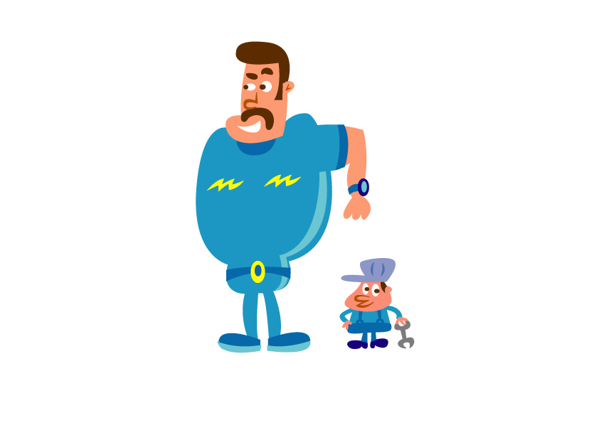
In some ways its fortunate Bunny and Cat were only pictured in silhouette (nice touch). If this card were any cuter it would get its own wing of the zoo.

Here's a case of successful irony. The card plays on 1950's magazine advertising and Donna Reed visions of the happy American family, it also nods to the tradition of family photo cards. Obviously, that's tongue-in-cheek. It works because its open, its happy. It displays a joy and a love that can only be spread through the U. S. Postal Service.

Joey Ahlbum.

This year, some of the old stand-bys came through again.


Phil Marden.

Both of these cards are digital prints. Joey Ahlbum's card uses toothed paper stock to hide the print process.

Phil Marden's card minimizes color and simplifies line to keep from taxing the limits of his print process.

Lizzy McGlynn and Mark Reilly sort of "bit" our idea to do block cuts. Of course, we might not have thought of it if not for "All About Prints" which we worked on with Lizzy. So they get a pass.

Simple, handcrafted, classic design. A card you can send to your 7 mass a week Grandma, or your anarcho-syndicalist Nephew.

The best card of the year (maybe I should drag this out into another post) was determined by committee.

The staff agreed that a longtime card champion -an aged hero, as it were -once again grabs the ring.


We're not fans of the photo-print, in general. But once again, Tony Eastman makes it work. "Econo Christmas". Clever, festive, appropriate, original.

Friday, December 12, 2008

Ho Ho Ho! Mailly Christmas!

I count how long we've been in business by "holiday" cards. This year marks our fifth card.

Hopefully it bucks our downwardly spiraling trend of cards, each year being slightly less inspired than the last.

Since the Depression is on and everything, we decided to print the cards ourselves.

Here's Ryan DeCosmo at the press.

This year Christina Riley was responsible for the card. The first few ideas I came up with weren't very strong, and she did a nice, simple cut that works well (and matches the sign on our door).

Christina watches ink dry.


This is 2007's card.

Brian and I were in Mexico on a job when this was at the printer.

A few days before we left, I had a dream that I got into a fight with the printer. I never yell at people.

Sure enough, there was a miscommunication while I was gone and it was printed incorrectly. Sure enough, I was on the phone driving to pyramids yelling at the printer. A really expensive mistake. Printing is expensive, especially when you come up with these harebrained complicated cards.


The joke is that all the monsters that get "good" gifts like toy trucks and video games are sad, but the guy that gets broccoli is thrilled. Bizzaro world!

Here's 2006, by Joey Ahlbum.


We wanted this to open up a narrative triptych or one of those Mad Magazine back pages, where the full page is one image and the folded page another.

It doesn't exactly work, but Joey's art is great and the printing is excellent. Great color, strong blacks. Pleasing.

2005's is pretty good.

It doesn't have the wit that I'd like our cards to have, but it's a funny drawing. The monster has clearly been standing in the snow for a long time.

2004
The M that came to dinner is in the middle.