Showing posts with label bakshi. Show all posts

Wednesday, October 13, 2010

Holds - Hey Good Lookin'

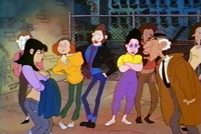
I almost forgot about the last scene in this sequence from Ralph Bakshi's "Hey Good Lookin'".

There's not too much to say.


The character design is relatively classical -a little Tex Avery, a little Disney in the eyes.  She comes out looking very Dean Yeagle.


The animation itself is workmanlike, it moves.  It feels a little "pose to pose".  The timing is strong: mostly two's with four holds.  The first hold is on drawing one.

There are 28 drawings in the shot.

The second hold, which was probably the layout drawing comes at drawing #10.


This holds for 8 frames (at 24fps).  The timing is good, but her animation into her next "pose" is linear, she takes the quickest route to the next position.

That's drawing 24.


This is a 6 frame hold which quickly animates to the final position:


Drawing 28


This final drawing, 28, holds for the remainder of the scene.  Over 1.5 seconds.

The animator rushed 12 drawings in the middle of the scene (between 10 and 24) when he should have taken the final two feet and used half to in that spot.  Another 8 drawings might have been enough to showcase the character in the transition between 10 and 24.

Still, that little timing squabble aside, the design and the animation express the character fairly well.  The timing is good in theory -but it rushes to that one pose a little too mechanically.

One big problem with the sequence: she goes into her apartment building.  Where is the old man, her father, going?  The other direction entirely.

Sunday, October 10, 2010

Turn and Fall

There are 47 drawings in the old man's animation from the "Hey Good Lookin'" scene posted yesterday.

He starts here.

1.

This drawing holds while the walkers make their exit.

In terms of direction, he's looking at the space cleared by Vinnie and Crazy.

Crazy exited towards camera when he was face to face the Old Man.

Those two have cleared the area where he exited to, so there's no reason for the Old Man to be looking there.

9.

His turn takes 8 drawings.  It's solid.  Being a poor animator, I sometimes think you can do anything in 8 drawings  -when I see that notion justified, it makes me feel better about my weak timing skills.

14.

He's exiting directly opposite camera.  This is something I've always found tricky.

It helps that the perspective is so clearly defined by the background. 

18.

Here's the vanishing point established in the foreground.  The deeper part of the background beyond the fence alters perspective in some ways.  It's like a backdrop or a painted flat.  Action isn't meant to happen there.

If the Old Man were to pass the fence, he could only turn directly East or West without giving away the perspective and ruining the scale the animation has established.

22.

This is one reason why his walk involves him hopping up and down.

23.

Which causes his pants to fall (remember he's removed his belt already).


33.

This takes 10 drawings (on twos) until tripping him up.


35.

And sending him headlong into the ground.

37.

39.

40.

42.

43.

44.

Saturday, October 9, 2010

We're Walking - Hey Good Lookin'

This is the second to last shot in the sequence from Ralph Bakshi's "Hey Good Lookin'" that we've been examining.


More interesting walks.

Two.  One of which -the old man's exit -is amongst the most difficult things to execute in animation.

At first glance, the humping couple in the foreground dominate the scene.  They're there for composition's sake -I understand that -but the wind up obscuring some pretty cool animation on the couple behind them.

Here's their walk (half walk, it's only one step).  On twos.

1.
We're looking at the couple in the middle.

2.


3.

4.

They're doing the "same" walk.
5.

"Same" meaning, each character is positioned and timed identically.
6.

In theory, an animator can do one character and then give it to the assistant to animate the other based entirely on what the first is doing.

That kind of mimicry is a good technique for learning.  Much better than copying generic walks from "The Animator's Survival Kit."
7.

Of course the woman's breasts are giving great buoyancy.

 8.

9.

Watch the hands.  They're not just lol-lolling like a metronome.  They're sharp, they're adding character to the movement.

10.

This might be a tradition walk's "passing point" -the highest point in the walk.
11.
#10 was just an inbetween.

12.
and so was #11

 13.
And #12.  13. marks the highest point.
 14.

The four drawings from 10 through 13 mark 1/3 of second on screen.  #14 here is an ease out of that position. That's 5 drawings for a point in the walk which textbooks assign a single drawing to.

This is precisely what gives life and character to this animation.

15.

We lose the woman behind the foreground characters.  I'm sure the animator did something amazing with her breasts -lost for eternity.

16.

17.

18.


By this point our walkers are completely obscured by the foreground fornicators.

We'll look at the old guy tomorrow.

Thursday, October 7, 2010

Buxom Walk

This is from Ralph Bakshi's "Hey Good  Lookin'" sequence posted yesterday.

The walk here sticks out.

For one thing, it's not a cycle.

It very well could've been a cycle, but it's not.

Here are three similar positions, the passing point drawing of the walk.

Drawing 1 (numbered arbitrarily -the others follow)

Drawing 15


Drawing 29


While the character's expression changes somewhat and she would break cycle for the final few drawings of the scene there's only one reason I can see that she was given 40 or drawings in this shot instead of 16: her boobs.
The breasts wobble at a different rate from the walk.  It's a kind of brilliant touch to the animation, it would have cost a few hundred dollars less to just cycle and pan her.  Even though it's not the most expressive animation, the idea behind it is sound.

Wednesday, October 6, 2010

Keep On Lookin'

After the last shots from Ralph Bakshi's "Hey Good Lookin'" sequence we've been examining we come to the long middle (close to the end).


Again, the difference in character design and animation styles is striking.

Above, Vinnie. Cut to:


Dad, above.

They almost look like they're from different pictures.

The animation follows suit.


Above: Stiffness in all the gestures, trying to "naturalistic" even when forcing perspective.


The father's cartoonishness welcomes the exaggeration the animation calls for.


Here you see Crazy bring that cartoonishness into frame with Vinnie.  Watch Vinnie's legs in the quicktime.

Friday, October 1, 2010

Hey, Crazy

The last post of Ralph Bakshi's "Hey Good Lookin'" showed off some of "Crazy's" eponymous animation.

This following set of scenes carries the character through the sequence, some animation is reused.


Interesting in these sequence are the background characters.


Above: The action has just happened off screen.


Above: Now, the character on screen is talking.  Their attention has shifted.

This is how actors train -always look at/focus on whoever the active player in the scene may be.  The audience will take their cue from the reactions of characters within the scene.

It's also a good to avoid saying something in a group situation (like a meeting you're not prepared for).  If someone asks a general question, just look at another person.


above: The same set up as before.  I love the character design of the background goons.  The one at the far right looks like a Mark Marek drawing.


above: Here we see a slight problem with the background characters.  They can jumble the layout.

The foreground action silhouettes well.  The three characters in the background do so as well -on their own.  When put together the background animation gets obscured.  That's work that's done -only a few drawings, sure, but work nonetheless -that doesn't make it on screen.

Another complication from the olden days.  The couple in the background are on one cel, the background guy another.  That leaves two cel levels for the three foreground characters.  Either Crazy pops cel levels without noticeable color shift (an incredible pain in the ass) or they've had to go to five cels.


Then, in this shot the background characters give a little interest to frame.

A shot with Crazy on the ground by himself might have a very different impact than this.

Tuesday, September 28, 2010

Good Lookin' #3

Here are the next two shots in this sequence from Ralph Bakshi's "Hey Good Lookin'".

The animation here is pretty interesting.


It's very loose and cartoony. It fits the characters' personalities.

Strike that -the animation develops the characters' personalities.

In the first shot, we have a funny, simple "take" by the father.

 1.
 2.
 3.
4.

Only four drawings required.

1. is the starting position
2. is an inbetween of 1 and 3
3. is the downward extreme
and
4. is an extreme the other way.  NO INBETWEEN

The pop between 3. and 4. is what makes it work.

There's no "settle" back to 1. here (which is often required in a "take") because Crazy fills frame.

We then cut 180 degrees to the Father's point of view.  Crazy's animation is, well, appropriate.

It's a 3 second shot, entirely on 2's (meaning 36 drawings).  Here are some of the key poses he goes through.


1.
4.
 9.
15.
 17.
 18.
 23.
 24.
 25.
 26.
 30.
36.


Before we get any sense of the character from dialogue, we figure that "Crazy" really is unhinged through his animation alone.

I don't know who is responsible for this animation, but it's goofy bizarre in a great way.