Showing posts with label art. Show all posts

Saturday, May 21, 2011

Cole


Doing some more research and found this nice little film on Thomas Cole on the website for his landmarked home in Catskill.

Thursday, April 7, 2011

Collaging A Collage

We've been contracted to do the graphic for the NEH/PBS initiative "Picturing America".

This has mostly been the title sequence and typesetting with a couple other things here and there. That's in addition to the handful of full subjects we've produced.


Last week we began discussing with Gail Levin a way to illustrate the construction of Romare Bearden's "The Dove".  The impetus behind this idea was the voice track of his niece describing the artist's thought process.

We thought it would be interesting to document the process as we go along.

Today we got the audio cut.


Step One: Listen to the voice over a few times.

Step Two: Type the transcript.

Step Three: Verbally run our idea by Gail.

This little bit is deceptively difficult.  When it's complete it should easy and obvious, but getting there might be tricky.

The primary concern in creating illustrative graphics about art is to be "true to the subject."  At least in these educational films.  Reverence is appropriate.

What is difficult here is that we'll need to show the construction of the collage without the benefit of pulling apart the layers from the original. 

Our next step will be to sketch a rough concept board.

Friday, March 4, 2011

Things You See

Last night I went to Hine Mizushima's opening at Gallery Hanahou in the Cable Building. It's actually a group show, four craftsy felt artists.


Hine did an updated version of "Why Does The Sun Shine?" for They Might Be Giants Here Comes Science DVD.


We did a version for Ka-Blam! a million years ago.

What I didn't know going in is that the gallery is affiliated with CWC-International, the terrific artist agency.  It's been a long time since I've seen Koko, the director (or whatever her title is) -since we did the Parco/Blythe project for Japan, probably -so it was great to make the reconnection.

Saturday, February 26, 2011

Sunday, February 20, 2011

New York Dolls

I hadn't been to the Museum of the Moving Image since its renovation.

That was a few years back. I remember it being more friendly, less airport-y. I also remember the permanent exhibition to be more interesting, less Hard Rock Cafe.

That's how time distorts memory. Things seem better then than they are now.

This weekend they're doing a series on Manhattan Cable Access. It sure makes New York City seem like a much cooler place 30 years ago than it is today. Even the woman obsessed with "clubs" seems like a genuine weirdo and not a pseudo-socialite on a shoe shopping mission.


The other impetus for the visit was to take in my pal Martha Colburn's new film, "Dolls vs. Dictators" and the adjacent installation. The museum commissioned it.

I saw a version in progress a little while back. The color of the project here looks great.

The show runs through April 10.

Sunday, January 23, 2011

George Grosz Photographs, Part 2 of 2

Here are the remaining five images from the 1977 monograph of George Grosz' photography.

These are all images of New York from the eyes of an immigrant in 1932.

The first set were his passage.


Even a guy fresh off the boat would get his shoes shined.


The pamphlet includes this poem:
America!!! Future!!!
Engineer and Salesman!
Steamships and express trains!
But above my eyes
stretch gigantic bridges
and the smoke of the hundred derricks

        From "Song of the Gold Diggers"
        George Grosz, 1917
 Double Decker, 1932

And the final photo in the booklet, "Young American", is a strong connection to his great caricature and portrait work.


Saturday, January 22, 2011

First Landing - George Grosz Photographs

We all know George Grosz as a great cartoonist.  One of the greatest in history, actually.  He was also a top notch paint, of course, applying many of his skills as a caricaturist to his portraiture.  As a painter, he's on the top echelon of era, a particular fecund period in European art.

He also had a camera.  During his flight from Fascism in 1932 he used it to chronicle his voyage over the Atlantic and arrival in New York.


This is a small catalog from a 1977 exhibition of his photography.


The catalog isn't archival so the paper has turned. The scanner also picks up the grain.

A large component of photography is access -just being there, at the right place in the right situation.

This images certainly benefit from the charged situation of Grosz' passage.


Some, like "Fellow Traveller", exhibit the same touch for capturing the life of a person and showcasing them in a unique light which makes Grosz' work with pen and paint remarkable.

 Above: "Remembering"

The remaining five images from this portfolio will be posted tomorrow.

Saturday, October 2, 2010

The Oxbow

Here's a super sneak preview of a project at a very very early stage.

This is a film concerning Thomas Cole and a bunch of stuff, mainly through the prism of his painting "The Oxbow" and his architectural work on the Ohio State Capital.


Above: the painting.

Below: The Oxbow today


Either the mountain has shifted, or the painter reworked the landscape to fit his own scheme.

Just as creative people don't need to be on drugs to come up with outlandish ideas, painters don't need and picture perfect to create a landscape.

Wednesday, August 25, 2010

Burchfield, John and Mary

John Canemaker wrote a typically excellent piece on Charles Burchfield for Print.  On his recommendation, after being stopped in my tracks by the bus kiosk ad, I visited the Whitney for “Heat Waves in a Swamp: The Paintings of Charles Burchfield.”

It's an exhaustive exhibition, de rigueur for today's blockbuster art economy, that leads you from interest to apathy to excitement.

While Canemaker discusses Burchfield's relationship to animation his article stops short of going into animation's relationship to Burchfield.

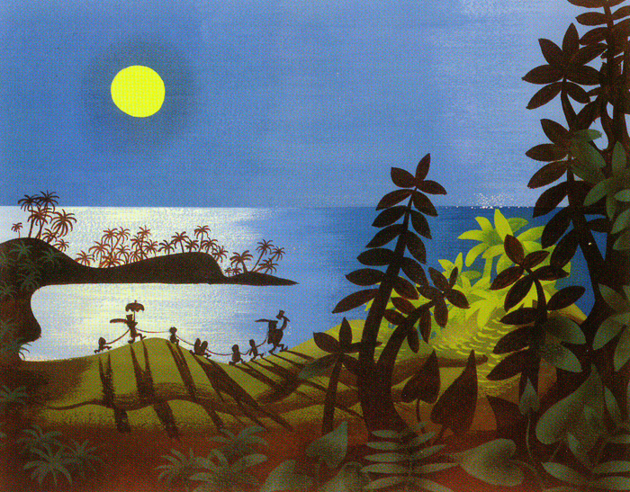
John's affinity for the painter is clear.

(above) Bridgehampton by John Canemaker


(above) Untitled (Landscape with Trees and Birds), 1925.  
Currently on exhibit at the Alexandre Gallery, 41 E. 57th Street.


Burchfield's loose, almost abstract, landscapes are more of graphic recreation of a feeling than the fastidious landscapes of 19th Century.  This is a style which is very "animate-able".  It's visually appealing, quick to draw, and repeatable.

Traces of his work can be found in Mary Blair's work for Disney.
(above) By Mary Blair from Peter Pan  (linked from Michael Sporn, scanned 

(above) "Fireflies and Lightening" by Burchfield, in the Whitney Exhibit.

I know it heretical in animation, but I've always found Mary Blair's work teetering on kitsch.  And this comparison helps explain that impulse.

Burchfield was one of America's best known artists in the first half of the century.  He was the star of the MoMA's first one man exhibit, he had a very successful line of Christmas cards and feature articles in "Fortune", "Life" and other national magazines.  It would be hard to believe that the Mary Blair wasn't aware of his work.

Many of the ideas in his paintings are evident in the Disney work.  The contrast of dark foreground with open skies.  Depth built through a chiaroscuro of color fading from saturation to white.  Natural forms indicated through shape.  The repeat of figures.

The Disney work polishes it until the shine is obvious.  Again, the comparison to Bridgehampton is telling.  Canemaker, like Burchfield, trusts the audience to commune with the artist.  The Mary Blair designs, one cog in a mechanical assembly, never take that leap.


The show at the Whitney runs eight galleries.  In the first, we're introduced to sketches.  Mostly nightmarish stuff with sinister titles.

This opens into a room containing the work shown in his 1930 MoMA exhibition (much from his 1918 of his annus mirabilis).  These are nice -some are particularly Mary Blair -but altogether not so impressive.  It's clear the artist isn't a master of his trade, there's a lot of "fix ups" in the watercolor and he either doesn't  trust negative space or can't control the pigment well enough to create it.  You get the impression of stumbling on some great yard sale find, not an American master.

The next few galleries (with the exception of his very cool work as a wallpaper designer) cement this opinion.

But then

Wow.

In his notes the artist writes how he abandoned a version of this (above) painting, The Coming of Spring, years earlier because he didn't have the tools to complete it.

After working up the masterpiece, he revisited the old in the style of his younger self.


The final gallery is full of paintings from this period from the 1950s through his death.

Walk quickly through the rest of the show to have the time and energy to spend here.  The promise shown in those WWI era watercolors fully blooms in the final two decades of the artist's life.  And, unfortunately there's very little animation like it.

Sunday, August 22, 2010

Nhek Dim Watercolors

A couple days ago we posted some political cartoons by Nhek Dim, a Cambodian artist who was murdered by Khmer Rouge in the late 70s.

Here are some of his paintings.

A village from 1975.  Love the trees.


More of those trees, and some people.


That, I believe, is a cyclo.  Romance in the park.

Wedding.


1974.

Luscious sky over a river village, 1973.  I wonder how true the reproduction is to the original color.

Monday, July 12, 2010

Closed Monday

Here's another gem from a recent trip to the Metropolitan Museum.

Portrait of Mr. and Mrs. Lavoisier by Jacques-Louis David


This portrait is somewhat overshadowed by it's neighbor, David's masterful "Death of Socrates".  The portrait of Lavoisier doesn't have the bravado of that somewhat earlier work but there's a confidence in the understatement.

David, of course, was a Jacobin and this painting was not permitted by the Monarchy to be exhibited.  Lavoiser was also a revolutionary.  Known today for his contributions to chemistry, he was ultimately executed on the word of Marat (the subject of another David masterpiece -a painting often used as the cover for the greatest historical study of the era de Tocqueville's "Old Regime and the French Revolution").  He held the uneviable position of taxpayer. Marat claimed he was using false weights, selling cut tobacco and was in league with foreign counterrevolutionaries, probably payback for a slight delivered years earlier.

Years later Lavoisier was exonerated and his property returned to his widow.


Beautiful glass and subtle light in this painting.

The air in the room also forms part of the portrait.  A remarkable work.

Monday, July 5, 2010

The Trojan Women Set Fire to their Fleet

The Metropolitan Museum is a pretty exhausting experience.   Almost every visit, though, reveals a treasure somehow missed in previous tours.

Claude Lorrain's "The Trojan Women Set Fire to their Fleet" is one such standout.  It's dated ca. 1643 and seems several generations ahead of it's time in composition and perspective.  While historical paintings were not unheard of in the 17th Century, they didn't yet have the popularity they would find 200 years later after the advent of Jacques-Louis David and the Revolutionary era.


There's something especially moving about this painting.  Great perspective, yes, masterful technique moreover an interesting moment to depict.

If you recall your AP Latin class, Virgil tells how the women of Troy -sick of the never ending war -decide to set fire to their own ships to hasten it's end (even if it means the fall of their own state).  The gods, of course, stir up a storm to extinguish the fire.  The blood lust of deities is not so easily quenched.

This is a video taken with the phone, so excuse the quality.  It's also a kind of technique test for some other projects we're working on.


The YouTube compression makes the phone look even worse...


Great waves.

Tuesday, June 8, 2010

Four Johns

We've been making a little film on Thomas Eakins' "John Biglin in A Single Scull".

In addition to being known as the best draughtsman of his day, Eakins was meticulous in his preparation.


He figured out all his perspectives on paper.

And then did a study:


in oil, to prepare for the "final" watercolor.

This is part of his rowing series.   It marks his first major body of work.  Most of the series are oils, but he crafted  "John Biglin in a Single Scull" as one of his few watercolors.

This is the original which is in collection at Yale:


He was so proud of the work that he sent to his teacher, Gerome, in Paris and made a copy for himself.

Below is the copy which is in the Metropolitan Museum's collection.


These pieces are "works on paper" and can not be restored.  As such, they rarely if ever go on public display.  You can see the discoloration (in the original especially, since that's a high resolution photo we took) by look at the edges where the pieces were once framed.

Wednesday, May 26, 2010

Oxen

A few years back we worked with Merchant/Ivory on their film "White Countess".

About an hour or so into the film, a little girl looks into a picturebox and her imagination brings the slide to life.

James Ivory brought in Quan Handong to illustrate the sequence.


These are paintings from his "Ox Series" taken from a monograph published by Queens Council on the Arts based on an exhibit of the work.


His designs for "White Countess" are more concrete but they retain the looseness and energy.


We got a crash course in Chinese painting history while working on the project.  The broad strokes -much of the Classical art can be broken into two schools: the Northern which is based on strong black strokes, and the Southern which is more calligraphic.

I hope I remember that correctly.


In these Ox Paintings, the paint brush is charged with a controlled frenzy.   It's like the ultimate Steinberg -all in the line.


In his notes on the exhibit Quan Handong remarks: "the ox represents both a strong being and a symbolic abstraction."

The scanner was unkind to this image and I tried to adjust the contrast.  There's a lot of detail in the black that's gotten crush although the blue is close.

Saturday, May 1, 2010

Closed


I never got around to seeing the Tim Burton show at the MoMA.

Fives times during its run I was at the museum- twice too apathetic to try, the others too late to get tickets.


Nothing against him -heck I like chicks in stripey tights more than the average bear -but he strikes me (especially in relation to animation) as a gothical Jim Davis. He's the creator of a stylistic empire.

I do like his drawings a good deal -especially his more Ronald Searle looking ones.  When he's not being Hollywood-maudlin his films are entertaining.


From all accounts it was an excellent show.  And I'm glad to have picked up the museum's exhibit guide.  I can't say I'm sorry to have missed it, since it's overcapacity crowd allowed me to spend more time in the Kentridge show.