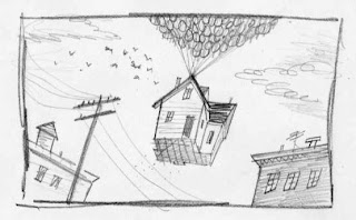
If glowing reviews can't get me to the theater, maybe Bob Staake's "New Yorker" illustration would.
Here's the review.
Bob has done some animation work himself, having been a designer on "Dexter's Lab" and other kid shows (and apparently helped our friend Bill Plympton on his first professional film -thanks google!).
He's kind enough to allow us to post some of his sketches, showing the thought process behind this illustration.
 this rough, and ultimately the finished piece.
 variation
The differences between the above sketches are principally visceral. The dynamics are similar -in the middle of the three, the kid is closer to scale -the other two exaggerate and force perspective.
The bottom has the house at more of an angle, showing a greater lift. The top includes surrounding buildings giving both scale and strong compositional perspective.
The bottom has the house at more of an angle, showing a greater lift. The top includes surrounding buildings giving both scale and strong compositional perspective.
 earthbound
ABOVE: an entirely different idea
BELOW: without humans the illustration becomes still more different
BELOW: without humans the illustration becomes still more different
 wistful
Great illustration captures the essence of a thing -a person, an idea, a film and summarizes in sharp graphic shorthand. Further still, a great illustrator tells us something about the subject we might not have known.


1 comment:
I saw the illustration yesterday and looked closely at it. Very nicely done (which is more than I can say for Denby's review.)
Thanks for the view into the process.
Post a Comment