Here's the last of the McLaren monograph.
Thanks to Kristen Collins for helping by scanning this section.
Sunday, May 31, 2009


Saturday, May 30, 2009
Dr. Worm
We've been getting a lot of Youtube comments on some pieces we did for KaBlam! back in the Twentieth Century.
By producing "Hockey Monkey" we had worked ourselves back into the graces of Bob Mittenthal at Nickelodeon.
They called us in to meet with John Flansburgh and John Linnell of They Might Be Giants about a similar little film. Someone had play the Hockey Monkey for them at party sparking a songwriting revelation -in Flansburgh's words "Counting! Why didn't we think of that?"
Brian and I left 1633 Broadway with a CD of "Dr. Worm."
They gave up an open assignment. Maybe the narrator was a worm, maybe he wasn't. Maybe he was a doctor, maybe he wasn't.
Whenever we're given free reign with drawn animation, we like to call up illustrators or cartoonists whose work we like but have never gotten the opportunity to animate.
For this the appropriate call was to Kaz. He worked up designs and along with Jesse Gordon we came up with a treatment.
Like the Hockey Monkey, we intended to use both live action and animation. Of course, the second time around you have to make it more complicated.
In the opening sequence, the animated Dr. Worm pops up from under a live action flier. It may seem cheesy but we had a pencil underneath shake it before he popped up to sell the integration.
The trickier shot was the pan down the pole.
The piece was shot on 16mm, hand held, so the composite was fairly time consuming as the animation had to appear as though it circled around the live action.
Here's the piece.
We filmed this around Williamsburg. It was really cold.
The boys came from LaGuardia High School, the one girl is my friend Kendra Barber who's appeared in several of our cheapo shoots, the other was a friend of Scott Dodson who was interning at The Ink Tank at the time.
The final scene was shot at Galapagos. They were complete jerks and made my life harder.
What else? Jesse Gordon is responsible for the creative direction. Tissa David did the animation. Valerie Cardon inked the vole, Matthew Salata inked mostly everything else. I think Scott may have done some too. Alex Reshanov took care of the compositing.
Friday, May 29, 2009
And In This Corner...
Saturday evening I saw "Tyson". The duration of film is a virtual monologue by the boxer. Born in New York, brought himself to the height of his profession giving credit to his mentor, traveled the world.
We all know about the tragedies of Iron Mike through the tabloids and talk shows. The film does little to temper the impression that he's a maniac, but it's not unsympathetic -ultimately painting a subtle portrait of man who may just be a scowling cartoon.

"Tyson" was followed up this week by "Milton Glaser: To Inform and Delight". This documentary is also a virtual monologue, this one presented in multiple locations with occasional guests in contrast to the starkness of the boxer bio.

Milton Glaser -also born in New York, also the height of his professional who praises his teachers, also a world traveler -smiles through the entire documentary.
And why not? The film about him may not be as polished or moving or (ironically) even as well constructed as "Tyson" but it shows nothing but happiness in his life.
The documentary presupposes that you already know a good deal of graphic design history. Not only the hegemony of "Swiss style" design of the middle 20th Century which Glaser was instrumental in breaking, but importance of Folon, the family tree of Pushpin, and the impact of New York Magazine on the entire publishing industry.
It was the second and third in what would ultimately be four spots for an investment firm.
This was probably 1997, at The Ink Tank. Brian was bidding the job with an ad agency we had a good relationship with. The agency producer (no longer at that company) still calls us for projects a decade later.
We were pitching the design and contracted Richard McGuire and someone who I've forgotten to create models. Everything was going along fine when Brian detected the job, as we say, was going South. He asked the agency what the deal was. The producer told us they were triple bidding (as always) and the competition was presenting Seymour Chwast. The bigwigs at the client were wowed by that.
 Incidentally, Seymour Chwast designed The Ink Tank's logo
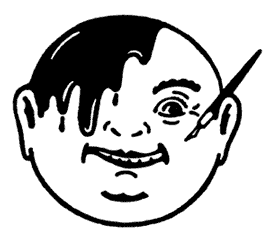
 Moments after I poked my head into the airbrush room to update him on events,
Bob emerged with this. He then fiddled with it for hours.
We all know about the tragedies of Iron Mike through the tabloids and talk shows. The film does little to temper the impression that he's a maniac, but it's not unsympathetic -ultimately painting a subtle portrait of man who may just be a scowling cartoon.

"Tyson" was followed up this week by "Milton Glaser: To Inform and Delight". This documentary is also a virtual monologue, this one presented in multiple locations with occasional guests in contrast to the starkness of the boxer bio.

Milton Glaser -also born in New York, also the height of his professional who praises his teachers, also a world traveler -smiles through the entire documentary.
And why not? The film about him may not be as polished or moving or (ironically) even as well constructed as "Tyson" but it shows nothing but happiness in his life.
The documentary presupposes that you already know a good deal of graphic design history. Not only the hegemony of "Swiss style" design of the middle 20th Century which Glaser was instrumental in breaking, but importance of Folon, the family tree of Pushpin, and the impact of New York Magazine on the entire publishing industry.
*****
One of the first commercials I "produced" (in more quotes than usual) was designed by Milton Glaser.It was the second and third in what would ultimately be four spots for an investment firm.
This was probably 1997, at The Ink Tank. Brian was bidding the job with an ad agency we had a good relationship with. The agency producer (no longer at that company) still calls us for projects a decade later.
We were pitching the design and contracted Richard McGuire and someone who I've forgotten to create models. Everything was going along fine when Brian detected the job, as we say, was going South. He asked the agency what the deal was. The producer told us they were triple bidding (as always) and the competition was presenting Seymour Chwast. The bigwigs at the client were wowed by that.
 Incidentally, Seymour Chwast designed The Ink Tank's logo
Not to be outgunned with 1960's design firepower, R. O. Blechman (our "boss") said "Well, if he's pitching with Seymour, we'll get Milton Glaser."
And so we landed the account.
The first spot was done on film. A year later, I was working primarily on "Troubles the Cat" when the second contract came in. The commercial producer was on vacation and I was eager and foolish enough to plant myself in the middle of production.
This was being painted digitally at Tape House Digital Ink and Paint (before they re-christened themselves the abhorrent "Tape House Toons", ugh "toons"). They insisted that every color be delivered on a separate cel level. This was a spot that featured no fewer than 13 characters wearing all sorts of patterns frequently on screen at the same time. And color blending? Fuggeddaboutit.
In the long run Brian and production co-ordinator Laura Kraning managed to shoe horn some sensibility into the process. I just observed slack jawed.
One spot was animated by Tissa David, the other Ed Smith. I only had glancing contact with Glaser and he was professional and courteous. It felt like he was doing the project, not so much for the money -which was good, especially the amount of work he had to do -but out of respect for his longtime colleague, R. O. Blechman. An lesson in human dynamics.
Years later I had a throw down arguement with another very well known designer/illustrator over Milton's 2001 re-vistation of I (heart) NY. I (heart) NY MORE THAN EVER, with a little singed heart.
Less than a month after the World Trade Center was destroyed, I felt the slogan was trite and dishonest. You really love NY more than ever? Because of this? On top of that, the elegance of the original turned leaden, heavy-handed. No, I (heart) NY -the original- said it all. I (heart) NY 2001 was so many George Bush's throwing first pitches at Yankee Stadium. Maybe you'd feel good about it in the moment, but where did this bitterness in the pit of your stomach come from?
Blechman's illustration -dashed off right after the second tower fell -I argued was far more poignant. And far better design. It's shorthand conjured Glaser's logo, the towers themselves, and summarized our basic emotions of the event. Illustration cognosci could even recall Blechman's own "New Yorker" cover of the 70s with the World Trade Center converted to energy-saving windmills.
And so we landed the account.
The first spot was done on film. A year later, I was working primarily on "Troubles the Cat" when the second contract came in. The commercial producer was on vacation and I was eager and foolish enough to plant myself in the middle of production.
This was being painted digitally at Tape House Digital Ink and Paint (before they re-christened themselves the abhorrent "Tape House Toons", ugh "toons"). They insisted that every color be delivered on a separate cel level. This was a spot that featured no fewer than 13 characters wearing all sorts of patterns frequently on screen at the same time. And color blending? Fuggeddaboutit.
In the long run Brian and production co-ordinator Laura Kraning managed to shoe horn some sensibility into the process. I just observed slack jawed.
One spot was animated by Tissa David, the other Ed Smith. I only had glancing contact with Glaser and he was professional and courteous. It felt like he was doing the project, not so much for the money -which was good, especially the amount of work he had to do -but out of respect for his longtime colleague, R. O. Blechman. An lesson in human dynamics.
*****
Years later I had a throw down arguement with another very well known designer/illustrator over Milton's 2001 re-vistation of I (heart) NY. I (heart) NY MORE THAN EVER, with a little singed heart.
Less than a month after the World Trade Center was destroyed, I felt the slogan was trite and dishonest. You really love NY more than ever? Because of this? On top of that, the elegance of the original turned leaden, heavy-handed. No, I (heart) NY -the original- said it all. I (heart) NY 2001 was so many George Bush's throwing first pitches at Yankee Stadium. Maybe you'd feel good about it in the moment, but where did this bitterness in the pit of your stomach come from?
Blechman's illustration -dashed off right after the second tower fell -I argued was far more poignant. And far better design. It's shorthand conjured Glaser's logo, the towers themselves, and summarized our basic emotions of the event. Illustration cognosci could even recall Blechman's own "New Yorker" cover of the 70s with the World Trade Center converted to energy-saving windmills.
 Moments after I poked my head into the airbrush room to update him on events,
 Bob emerged with this. He then fiddled with it for hours.
"To Inform And Delight" makes one profound point: we all know Milton Glaser. We may not all have these second-hand brushes with him, and this film certainly reveals his gift as a lecturer more than a character. We know him intimately through his work which flows all through the city: Grand Union, Brooklyn Lager, I (heart) NY, even The Rubin Museum.
Thursday, May 28, 2009
Origami - post 3
Here we have a lot of drawings.
I wanted to pull some animation from "Origami" and this is a scene that was handy.
You have it in color. The animation is by Ed Smith from Matt Stoddart's characters.
A few things on Ed's animation:
1) These are his actual drawings. Before he begun we experimented with media and determined Prismacolor pencils gave the "crayon" look.
Why not use crayons? They're too small, they dull quickly and don't sharpen well, since they don't sharpen details are difficult, they smudge, are difficult to control and expensive.
2) This doesn't consider exposure. There are 39 original drawings. The sequence has 57 exposures -that means there are 18 instances of reuse.
3) In addition to reuse, showing the art in this manner doesn't account for timing or holds.
Regarding the art production:
1) The linework is Ed's, the shading is in Photoshop.
2) The boy is on the cel level beneath the boat. In the old days he'd be on top and match lined to the top. Here he's underneath and the boat is masked where his arm crosses over.
3) The bottom of the boat will ultimately be under water, that's why it's sloppy.
4) Newspaper hat is cut and paste in Photoshop.
5) Cheeks -one dab of soft brush at 60% opacity.


Subscribe to:
Posts (Atom)