Showing posts with label storyboards. Show all posts

Friday, April 22, 2011

Storyboard Reality

This is a rough storyboard Brian did for a sequence in the PBS documentary series Make 'Em Laugh directed by Michael Kantor.

It parallels the opening sequence we made for the episode which illustrates classic situation comedy tropes.

By the end of the episode, reality shows are suggested to be a replacement to the sitcom -at least in terms of popularity.


We'd rather watch untalented people make fools of themselves than watch great comedians like Jackie Gleason.


This is also when I first heard of Teela Tequila.

So you can learn something new on every job.


We used a pretty stiff photo cut out style here.


We have limited material to use, basically a single photo for each character.


That meant the animation would need to behave like traditional under camera cut outs.

Sunday, January 9, 2011

Monroe Board


After the (very detailed) bible, FX contracted us to script and board a pilot episode.


John Freeman Gill wrote the script in collaboration with Sam Henderson, who boarded the whole thing.  John has since written some great features for "The Atlantic" and done a number a cover stories for the New York Times.


I like how the board hints at the eccentric style of animation which would push the comedy.


As you can see, it was a full length story.

Administration changes at the network contributed to this project being passed on.  I still think it's, in essence, a great idea.

Fortunately for Sam, his experience boarding this helped him land a job writing for Spongebob Squarepants. Any comedy show would benefit from having him on staff.

Thursday, November 11, 2010

Testing 2

Here's the other board we did for the pitch I discussed yesterday.


Again, Brian did these quickly as starting points for production.


We worked up two segments for this because each represent a distinct concept.


Yesterday's board was about theory. This was showing space as well as a possible approach to "re-creation".


Re-creation is a tricky issue in documentary. More and more we're finding producers wanting more interesting techniques to replace the old stand-by of guys in wigs.


Since animation can be so many different things, and costs have dropped dramatically in the past several years, exploring different ways to represent the unfilmed or unfilmable past is a smart idea.


Tomorrow we'll be posting some of the designs for this board.

Wednesday, November 10, 2010

Testing 1

This is the starting point for some work we did pitching a project.

The producer -a friend of a friend -contacted us with a prospectus (and a little bit of cash) to come up with some creative treatments for his film.


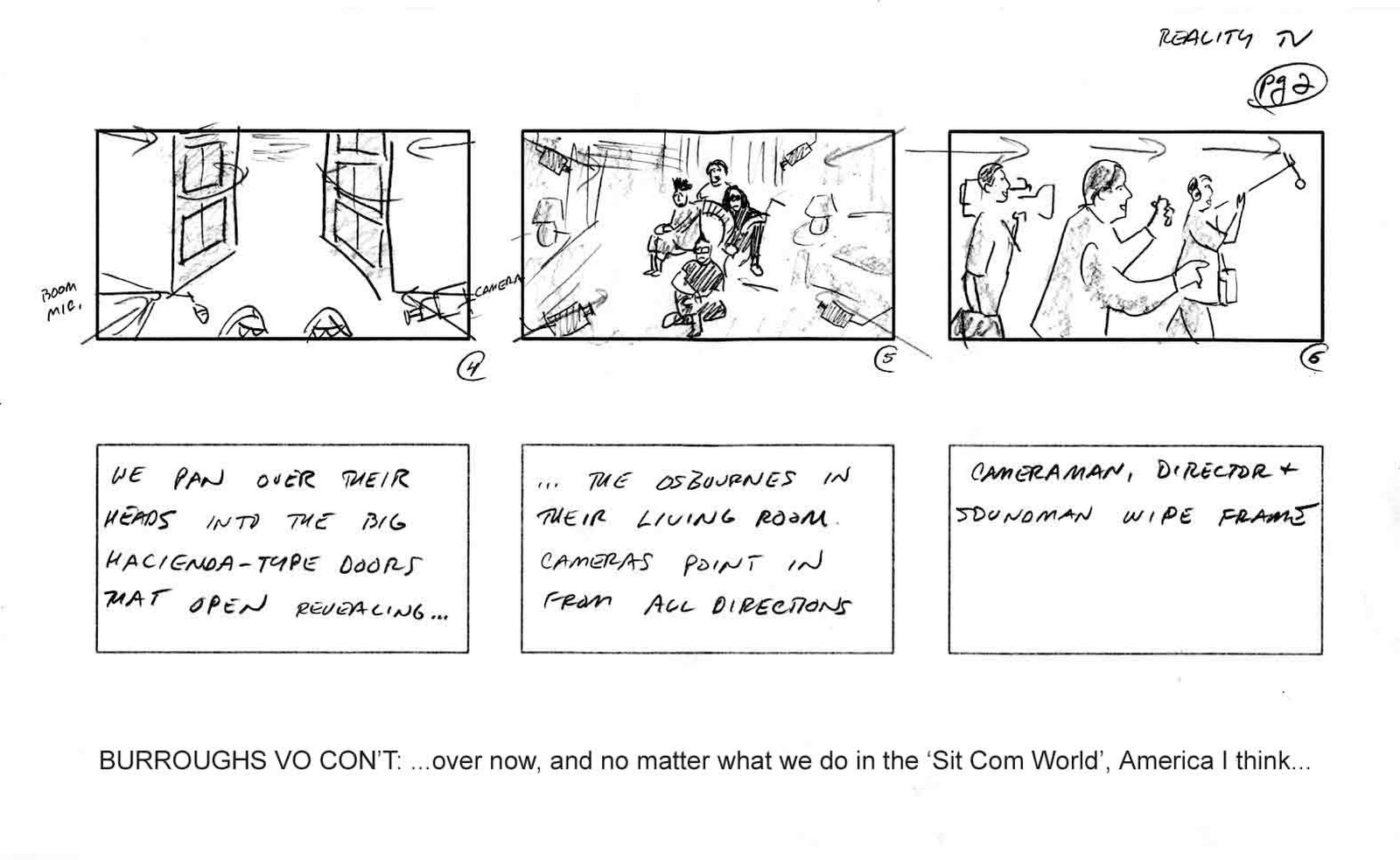
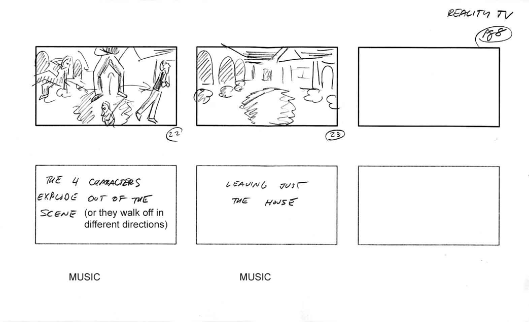
Brian came up with these rough boards.


They're not meant for presentation -that is, they aren't supposed to be pretty.  They're a functional basis for communicating visual ideas within a small production unit.


Our assignment here was to come up with a visual and cinematic approach. Brian's boards here (after a provided script) represent the first step in that development.


We would ultimately create a sort-of animatic to demonstrate these ideas best.


While we didn't wind up working on the project for a myriad of reasons, the process behind the visual development was solid.


It usually bugs me a little when we have to jump through hoops like this to produce a project -especially low budget ones where they should be thanking us for just considering to help them. But whenever a potential client steps up and offers a stipend for a week or two of preliminary development that makes them A - OK in my mind.


At this stage, the storyboard is still working out an idea. The next few stages of development will shape it even more.


Unlike storyboards for television series which typically need to be picture frame perfect (they often wind up as layouts), these types of boards are akin to boards for live action -the design style hasn't been established so you're just blocking ideas.


This was shown to the client before we proceeded with any motion graphic animatic work just to be sure we're on the same page.


Such a step ensures that the client is involved in the process and happy with the direction the test is going.


Meanwhile, we're working on designs and building whatever digital artwork ("assets" in moneytalk) we think will be needed.


We'll post some of these designs later.

Thursday, September 16, 2010

Cheesy Does It

This another board for the old TeleTV projects we did at The Ink Tank.


The final piece here was a bit of a mishmash. There were a lot of ideas and opinions on what it should be and we tried to incorporate everything.


Ron Barrett did an excellent job as an art director on this film. This board may be drawn by him, he was mimicking the agency art director's drawing style.


The concept in the board is true to the final, albeit some of the details change.


Krystoff Giersz animated the film.  He did a remarkable job on the dinosaur.


Krystoff is one of the most remarkably gift animators I've ever worked with.  At the time his English was pretty poor, but he could speak volumes with his animation.

Impeccable draughtsmanship, versatile stylistically, great great timing.


That was real life Zipatone in that board.


The "spaceship" was probably the second computer generated animation we did.  Tessia Machado created it.  3D in AfterEffects, 1998.

It looked a little like a hunk of cheese.

Monday, August 30, 2010

March 15, 1990 -Final Notes, Lip Synch and More

These are the last of the notes from the Tissa David lectures.  We'll have to get the tags straight so they're easy to find.  It'll be "notes".


Storyboard:

should have good soundtrack and story.
1) create environment (e.g. behind the couch, tiny space restricted to intricate perspective)
2) passing of time -window light coming in will establish time.
area being restricted (2 characters start at end where second character enters) this way you will avoid trap if not enough room.

From back of couch to outside atmosphere.  Should be planned so everything will be natural.

Horse: horse running has a stretch and a reach.  Stretch higher up and reach is lower.

Be original in your approach and don't be afraid to be inventive.  Don't be timid but be interesting and adventurous.  Exagerate.

Every action takes place on an arc.  Except when it is a zig zag very rarely.

[illustration]

Spacing should have an order.  It's almost as important as timing some sort of rhythm.


Mouth is part of face.

Skull stationary -the rest is movable.

Hand speaks as gestures, head must move when talking (tilt, up and down movements)

Vowels
Consonant- must have 2 frames
always closed mouth

Try to animate lip synch with only the shape of the mouth.  Avoid teeth (only use if ferocious)


Mouth should look like the sound and the contrasts will make it work.  You can exaggerate but don't over animate.

Simple lip synch and simple action.

When you have important dialogue the action can be ahead of the word.  Gesture can precede or proceed the word for...


effect and impact.

Monday, August 16, 2010

Big Throw

I'm an Eagles fan.

While I concede the negative connotations that go along with that -throwing snowballs at Santa, et cetera -I can also admit when another team (even the hated Giants) do something great.

This is something we're looking at for a project.  Eli Manning's improbable pass to David Tyree in the Super Bowl.


It's one camera shot (plus a close), and makes for a great dynamic scene.  An excellent storyboard study.

In the first panel we have the quarterback in a long shot, a crowd scene.    The Patriots defender crosses frame large in the second panel.  In panel three Manning escapes the crowd an drops back, giving a clear silhouette in the frame, this continues in panel 4.

Panel 5 is the ball in the air.

Panel 6 see the ball land in wide shot, in traffic.  We're not sure what happened as we zoom in to the scuffle.

The last three panels are another camera.  They could easily cut in after panel 6 for a continuous narrative action sequence.

This sequence, as true with most sports, follow the natural eye of the viewer.  It's how we track events.  Naturalistic storytelling benefits from utilizing the same patterns.

Saturday, July 31, 2010

Some More TeleTV Boards

These are a few more concepts created at The Ink Tank for TeleTV.

These were thought up and drawn by the inimitable Santiago Cohen.


These are meant to be simple, 5 second, 'bumps'.


There's something about these boards (the above in particular) which makes me think of Folon's TV ID from the late 70s.


Folon's an illustrator who's fallen out of favor.  I wonder how many American animators have even heard of him.


This would have been mixed media.  Simple.  Fun.

And sunset.

Wednesday, July 21, 2010

Time

A little while we posted a board of a project produced in the 90s for TeleTV.


This is a concept board by Suzan Pitt.


We pitched several ideas at The Ink Tank, opening the assignment to the whole studio.


This was the one I most wanted to see produced.


I had never seen a storyboard like this. 

What I find most appealing is that I wouldn't know how to make a film out of this board, but I know that it's a film I would like to see.


I guess that's an experience for another time.