Or maybe, it's in the wrist.
1.
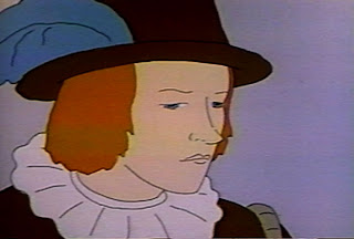
This is a scene Tissa David animated in "The Great Frost".
2.
5.
This is digitized from a VHS, so the accuracy isn't precise. Plus this was animated at 24 fps and I didn't do a .8 multiplication to convert from 30 fps.
8.
The body might be on a separate cel level, though I doubt it. It's more likely the eyes and mouth are on a top cel and the body is traced back on three cels which alternate exposure when the face animates.
12.
When the head turns, the body follows and there's no color pop. Which means either something really complicated happened, the production artist was really good at mixing colors, or it was on the same level the whole time.
19.
I'm inclined to think the eyes and lips were separated onto a top level, the whites of the eyes were painted on the bottom/body level and only the blue of the eyes and the line work were on the top level.
22.
But it's also entirely possible that 30 odd cels were fully painted. That's the sort of crazy thing that happens sometimes.
27.
No matter how this was produced, you can bet a lot of thought went into it.
35.
I remember going over a scene with a very skilled assistant animator and production artist. She was moaning and wailing about all the things Tissa did in the scene that didn't make any sense.
Not knowing anything about anything, I happened to make the right call -"just follow the sheets and instructions and we'll deal with it later."
39.
A day or so later, I checked in on the artist. She said that it's a good thing we didn't change the scene to do it her way -it wouldn't have worked. Tissa had already figured out the simplest way to put the whole thing together.
61.
65.
Slight head turn here.
69.
Traced back into the 90s.96.
101.
Back to the art production story. We followed the animator's instructions and the scene worked.
138.
It worked because she had already thought through the entire scene, not just how to get the action to move from storyboard panel A to storyboard panel B.
142.
That meditation comes through in the animation. Honestly, I think it's something that gets lost in digital production -most especially "symbol" based Flash animation.
146.
If it takes you a few hours just to figure out how to approach an scene, it's almost a given that your animation will be affected.
208.
212.
The limited animation actually helps. The drawings move slowly and the space between them is small.
214.
The movements are small and deliberate. Only the mouth twinges a little and the eyes go from one side to the other.
218.
The eyes are cast downwards. A naturalistic representation of thinking.
221.
There's a continual drift into the face.
It's slow but it goes from a fairly comfortable close, medium shot to a tight close up on his features.
224.
This camera move creates an intimacy which would not be so easily achieved with a locked camera and animation alone.
227.
This post is much longer than I had planned. Proof that planning is everything.
230.
Gerard Goulet taught me a word. It's a Quebecois Englishism - "planification". It's a good word and useful in animation.
233.
Watch the eyes in these drawings. The small differences between 227, 230 and 233 -that's where the character can be found.
236.
It also helps that there's a voice over in this scene, the narrator describes what's going through Orlando's head -but I really don't think that's the key to the illusion of thinking.
239.
That's all in the eyes and mouth (and camera).
241.
The overall understatement of the gesturing.
244.
There's a scene which follows this one in which Orlando starts to think with his arms. He raises them in anguish, covers his face.
247.
If you're going to double cut on a scene, you want to have somewhere to go, I understand. But in this case the gestures of the second shot become too broad. They're too broad period, but in comparison to the elegant understatement of this shot they're Jerry Lewis.
250.
Orlando appears to think here because of the simple subtleties in line and the deliberate nature of the timing.
253.
The whole of Orlando will be posted tomorrow, then we'll look at a dance next week.


2 comments:
Most animators turn to adding little bits of business (like chin scratching and hums and hmps) to indicate thinking.
As we see here, to really show a character thinking, it takes time, and it's all in the eyes, not the head tapping or the chin scratching.
very subtle movements looking at the cels individually.
Post a Comment