I used to have a few of these, but floods, vermin and other plagues did them in.
One of R. O. Blechman's original models for The Ink Tank was the Magnum Photo Agency. Replacing photographers with illustrators, he thought he could create an animation agency for the world's great print artists.
Seymour Chwast designed this poster with eight fingers -one for each artist in the stable. Blechman, Chwast, Maurice Sendak, Ronald Searle, Andre Francois, Edward Sorel, Chas. B. Slackman, and Jean-Michel Folon.
The Ink Tank evolved into a more traditional production company. I don't think Folon or Andre Francois were ever animated by the studio. Searle had some bits in a 2:00 spot for The Atlantic (I think), Slackman and Sendak only Simple Gifts. Sorel had a few commercials over the years, and Chwast has several.
Showing posts with label seymour chwast. Show all posts
Thursday, March 17, 2011
Sunday, March 13, 2011
The Push Pin Conspiracy
Here's an article from the March 6, 1977 The New York Times Magazine marking the 20th Anniversary of the Pushpin Graphic. Written by Harold T. P. Hayes
Gratefully, no doubt, considering the unlikely circumstances of its origin, The Push Pin Graphic will celebrate its 20th anniversary on March 24 with a retrospective exhibit of past issues at the Mead Gallery in New York City. The Graphic is one of the least known periodicals of its time, except to its small audience, which views it either as counterrevolutionary or irrelevant. (The February number, its most recent, has 32 pages of drawings and text devoted to "The Complete History and Knowledge of the World.") It is mailed free to its several thousand readers, but none of them, however they may regard it, will pay as much attention to what it says, as to what it shows.
The Push Pin Graphic is the propaganda organ of the Push Pin Studio, a handful of New York illustrators, designers and photographers whose work, like the Graphic itself, has to be seen to be believed. The studio's first marketable product, rendered in a loft on East 13th Street, was a gross of cork place mats. Today, the Push Pin Studio has become an attitude, its influence considerable. Over the years, Push Pin designers have come and gone, some to establish themselves in their own right (Paul Davis, Ed Sorel, Sam Antupit, Reynold Ruffins). But its chief proprietors, Seymour Chwast and (until he left two years ago to form his own studio) Milton Glaser, are its most celebrated members, and heir works have been exhibited collectively, under the Push Pin Studio name (at the Museum of Deocrative Arts in the Louvre, Milan's Castello Sforzesco, London's Reed House), and separately: Chwast's at the Brooklyn Museum and the Galerie De Delpire in Paris, and Glaser's at the Museums of Modern Art in New York and Brussels. In the past 20 years or so, having slipped in through the back door, the Push Pin Studio has come to be viewed as one of the two dominant schools in the international movement of graphic design.
Graphic design, a clumsy term, is the craft of reproducing words and images. It is held, as a ship by water, to the mechanical processes of reproduction, but only in the sense that the strange chicken head shown above (The Graphic's Eustace Tilley) could not exist as a graphic design without the paper and machines needed to print it. It is a craft that works on the eyes of the public, who respond to it without knowing where it comes from. A subway map is the work of a graphic designer, so are magazine illustrations, and traffic signs. So the CBS "eyes" and NBC's controversial N.
Whether all this may be described as an art form is unclear. "As the term 'graphic arts' is currently used," observes Glaser, "it can be applied equally to printed objects that are works of art (etching, engravings, woodcuts, etc.) and to those that convey only specific information (menus, announcements, books, etc.). Thus, both Picasso and the man who prints your laundry tickets can legitimately call themselves graphic artists."
But it is also significant that graphic design today is a business -an arm of industry seeking to sell something -or, as in an earlier time when terms were simpler, "commercial art". Graphic designers do not work for themselves; they work for clients. They tend to position themselves in the business world as illustrators, printmakers, photographers, typographers, art directors and visual consultants. In some cases they are directly responsible for making the product sell; in others, they are the last desperate line between sensibility and raw avarice.
Whatever their specialty, they are trained artists, and to a remarkable degree they have come to be responsible for the surface cosmetics not only of American society but -through their influence on communications and multinational corporations- of much of the rest of the world as well. They consult now with architects and city planners; they shape advertising and design trademarks. They advise on museum exhibits. Some have invaded the territory of industrial designers by creating tools, furniture and toys. A select few of them have created this country's exhibits at world fairs. And one design firm, Chermayeff
& Geismar, devised the symbol of the American Bicentennial.
Graphic designers concern themselves with the look of things, as graphic artists always have, but many of them do so now for more urgent reasons: "We have to deal with the clarification of information in a crowded environment," says the designer Rudolph deHarak. "The amount of communication data today is immense. What we are trying to do is synthesize information so that it may be conveyed efficiently and economically. We try to reduce the problem to its essentials."
DeHarak speaks for most designers today who fall within what is described as the Bauhaus/Swiss School style. It is a powerful influence dating to the 20s when a group of artists in Weimar sought to reduce to an underlying logic all the pars of a whole, from rocking chairs to housing developments. A reaction the gilded age, the Bauhaus style was spare to the point of austerity, functional, clean-lined and comparatively anonymous. By reductivism the designer could arrive at a grid system to project his solutions toward organic unity. Equally important was the Swiss School which, in a complementary fashion, began to reassess typography as a visual tool. Curlicues went out and bare-boned type came in. The absolute ultimate in no-nonsense lettering was a typeface that came to be called Helvetica. It remains today. The Mobil sign, again, is a derivative.
All this seemed to many designers, and still does, the most sensible way to dispense information in an orderly fashion to a mass society near deafened and blinded by too many words and images. It was an idea especially attractive to large industries seeking a public identity both visible and coherent -a neat, uncluttered way for monoliths to meet their public.
Thus has Bauhaus/Swiss flourished in the 20th century, and its elegant geometrics would no doubt have spread all the more had it not been for the pungent breath of Push Pin, gathering force in the late 50s and swelling to a gale in the anarchistic 60s. With premeditated irreverence, the Push Pin Studio was formed to provide clients an escape from the present into the reassuring heterogeneity of the past. Push Pin (which is nothing more than a pin
clockwise from upper left: Chwast, Glaser, Chwast, Chwast, Chwast (Threepenny Opera), Glaser (Dylan), Glaser.
with a rounded head) is no style, say it progenitors, it is all styles. The celebrated poster of Bob Dylan -as much a banner for the movement as the Bauhaus/Swiss Mobil sign -derives from a silhouette cutout by color motifs from Islamic art. By the late 60s, museum curators were cataloging modern graphics by two generics: post Bauhaus/Swiss, and Push Pin Studio.
While Bauhaus/Swiss is more visible today as institutionalized art- through its corporate signs and symbols, trademarks and annual reports -Push Pin has been a more intimate expression: poster art, book jackets and, especially magazine illustration. Graphic designers elsewhere watch American magazines with avidity, and it was through this medium, in the pages first of Esquire, Show, Audience, Ramparts, Playboy and later New York, where Glaser was design director, that Push Pin's influence spread. Glaser and Chwast say Push Pin is in fact as much a literary statement as an art form. It pursues the psychological implications of an assignment, dealing in irony, indirection, hyperbole and sometimes deliberate nonsense. Its artistic commitment is, first, to sensibility, and to this end it insists on the right to draw from any graphic element of the past. Consequently it is often referred to as nostalgic, and indeed, Push Pin is credited by many in the field for the revival of Art Nouveau and Art Deco, not only in graphic design but as manifest now in interior decorating, fashion and furnishings as well. But it draws as freely from other and older traditions, and it is to the further credit of its designers that, while the contemporary art history through the 19th Century, Push Pin, with its commercial skills, has managed to voice its echoes to the present.
Gratefully, no doubt, considering the unlikely circumstances of its origin, The Push Pin Graphic will celebrate its 20th anniversary on March 24 with a retrospective exhibit of past issues at the Mead Gallery in New York City. The Graphic is one of the least known periodicals of its time, except to its small audience, which views it either as counterrevolutionary or irrelevant. (The February number, its most recent, has 32 pages of drawings and text devoted to "The Complete History and Knowledge of the World.") It is mailed free to its several thousand readers, but none of them, however they may regard it, will pay as much attention to what it says, as to what it shows.
The Push Pin Graphic is the propaganda organ of the Push Pin Studio, a handful of New York illustrators, designers and photographers whose work, like the Graphic itself, has to be seen to be believed. The studio's first marketable product, rendered in a loft on East 13th Street, was a gross of cork place mats. Today, the Push Pin Studio has become an attitude, its influence considerable. Over the years, Push Pin designers have come and gone, some to establish themselves in their own right (Paul Davis, Ed Sorel, Sam Antupit, Reynold Ruffins). But its chief proprietors, Seymour Chwast and (until he left two years ago to form his own studio) Milton Glaser, are its most celebrated members, and heir works have been exhibited collectively, under the Push Pin Studio name (at the Museum of Deocrative Arts in the Louvre, Milan's Castello Sforzesco, London's Reed House), and separately: Chwast's at the Brooklyn Museum and the Galerie De Delpire in Paris, and Glaser's at the Museums of Modern Art in New York and Brussels. In the past 20 years or so, having slipped in through the back door, the Push Pin Studio has come to be viewed as one of the two dominant schools in the international movement of graphic design.
Graphic design, a clumsy term, is the craft of reproducing words and images. It is held, as a ship by water, to the mechanical processes of reproduction, but only in the sense that the strange chicken head shown above (The Graphic's Eustace Tilley) could not exist as a graphic design without the paper and machines needed to print it. It is a craft that works on the eyes of the public, who respond to it without knowing where it comes from. A subway map is the work of a graphic designer, so are magazine illustrations, and traffic signs. So the CBS "eyes" and NBC's controversial N.
Whether all this may be described as an art form is unclear. "As the term 'graphic arts' is currently used," observes Glaser, "it can be applied equally to printed objects that are works of art (etching, engravings, woodcuts, etc.) and to those that convey only specific information (menus, announcements, books, etc.). Thus, both Picasso and the man who prints your laundry tickets can legitimately call themselves graphic artists."
But it is also significant that graphic design today is a business -an arm of industry seeking to sell something -or, as in an earlier time when terms were simpler, "commercial art". Graphic designers do not work for themselves; they work for clients. They tend to position themselves in the business world as illustrators, printmakers, photographers, typographers, art directors and visual consultants. In some cases they are directly responsible for making the product sell; in others, they are the last desperate line between sensibility and raw avarice.
Whatever their specialty, they are trained artists, and to a remarkable degree they have come to be responsible for the surface cosmetics not only of American society but -through their influence on communications and multinational corporations- of much of the rest of the world as well. They consult now with architects and city planners; they shape advertising and design trademarks. They advise on museum exhibits. Some have invaded the territory of industrial designers by creating tools, furniture and toys. A select few of them have created this country's exhibits at world fairs. And one design firm, Chermayeff
& Geismar, devised the symbol of the American Bicentennial.
Graphic designers concern themselves with the look of things, as graphic artists always have, but many of them do so now for more urgent reasons: "We have to deal with the clarification of information in a crowded environment," says the designer Rudolph deHarak. "The amount of communication data today is immense. What we are trying to do is synthesize information so that it may be conveyed efficiently and economically. We try to reduce the problem to its essentials."
DeHarak speaks for most designers today who fall within what is described as the Bauhaus/Swiss School style. It is a powerful influence dating to the 20s when a group of artists in Weimar sought to reduce to an underlying logic all the pars of a whole, from rocking chairs to housing developments. A reaction the gilded age, the Bauhaus style was spare to the point of austerity, functional, clean-lined and comparatively anonymous. By reductivism the designer could arrive at a grid system to project his solutions toward organic unity. Equally important was the Swiss School which, in a complementary fashion, began to reassess typography as a visual tool. Curlicues went out and bare-boned type came in. The absolute ultimate in no-nonsense lettering was a typeface that came to be called Helvetica. It remains today. The Mobil sign, again, is a derivative.
All this seemed to many designers, and still does, the most sensible way to dispense information in an orderly fashion to a mass society near deafened and blinded by too many words and images. It was an idea especially attractive to large industries seeking a public identity both visible and coherent -a neat, uncluttered way for monoliths to meet their public.
Thus has Bauhaus/Swiss flourished in the 20th century, and its elegant geometrics would no doubt have spread all the more had it not been for the pungent breath of Push Pin, gathering force in the late 50s and swelling to a gale in the anarchistic 60s. With premeditated irreverence, the Push Pin Studio was formed to provide clients an escape from the present into the reassuring heterogeneity of the past. Push Pin (which is nothing more than a pin
clockwise from upper left: Chwast, Glaser, Chwast, Chwast, Chwast (Threepenny Opera), Glaser (Dylan), Glaser.
with a rounded head) is no style, say it progenitors, it is all styles. The celebrated poster of Bob Dylan -as much a banner for the movement as the Bauhaus/Swiss Mobil sign -derives from a silhouette cutout by color motifs from Islamic art. By the late 60s, museum curators were cataloging modern graphics by two generics: post Bauhaus/Swiss, and Push Pin Studio.
While Bauhaus/Swiss is more visible today as institutionalized art- through its corporate signs and symbols, trademarks and annual reports -Push Pin has been a more intimate expression: poster art, book jackets and, especially magazine illustration. Graphic designers elsewhere watch American magazines with avidity, and it was through this medium, in the pages first of Esquire, Show, Audience, Ramparts, Playboy and later New York, where Glaser was design director, that Push Pin's influence spread. Glaser and Chwast say Push Pin is in fact as much a literary statement as an art form. It pursues the psychological implications of an assignment, dealing in irony, indirection, hyperbole and sometimes deliberate nonsense. Its artistic commitment is, first, to sensibility, and to this end it insists on the right to draw from any graphic element of the past. Consequently it is often referred to as nostalgic, and indeed, Push Pin is credited by many in the field for the revival of Art Nouveau and Art Deco, not only in graphic design but as manifest now in interior decorating, fashion and furnishings as well. But it draws as freely from other and older traditions, and it is to the further credit of its designers that, while the contemporary art history through the 19th Century, Push Pin, with its commercial skills, has managed to voice its echoes to the present.
Sunday, December 12, 2010
Simple Gifts - The Great Frost
Here's the Great Frost in it's entirety.
The audio's awful. Poor mix to begin with, probably, and terrible VHS copy.
Shocking that they'd let so much film dirt on the air.
In the comments on Friday, Michael Sporn wrote of how he struggled to work Tissa David's drawings back into Seymour Chwast's style.
As the film goes on, you can the drawing look more and more Tissa, especially the woman.
Saturday, December 11, 2010
Thinking Animation
In the arm's length list of things which are difficult to do with animation, showing a character thinking is near the shoulder.
Or maybe, it's in the wrist.
This is a scene Tissa David animated in "The Great Frost".
It's limited animation. Apart from these first two drawings (which are on threes), the numbers below the image represent roughly the frame on which the drawing is exposed.
So these drawings trace back from 39 to the 60s.
Slight head turn here.
I'll also hazard a guess that the inking was done on the photocopier only because it's a very tight traceback and that's the cheaper way to go.
Back to the art production story. We followed the animator's instructions and the scene worked.
It worked because she had already thought through the entire scene, not just how to get the action to move from storyboard panel A to storyboard panel B.
That meditation comes through in the animation. Honestly, I think it's something that gets lost in digital production -most especially "symbol" based Flash animation.
If it takes you a few hours just to figure out how to approach an scene, it's almost a given that your animation will be affected.
A few things make this scene work. Make it look like Orlando is actually thinking.
Or maybe, it's in the wrist.
1.
This is a scene Tissa David animated in "The Great Frost".
2.
5.
This is digitized from a VHS, so the accuracy isn't precise. Plus this was animated at 24 fps and I didn't do a .8 multiplication to convert from 30 fps.
8.
The body might be on a separate cel level, though I doubt it. It's more likely the eyes and mouth are on a top cel and the body is traced back on three cels which alternate exposure when the face animates.
12.
When the head turns, the body follows and there's no color pop. Which means either something really complicated happened, the production artist was really good at mixing colors, or it was on the same level the whole time.
19.
I'm inclined to think the eyes and lips were separated onto a top level, the whites of the eyes were painted on the bottom/body level and only the blue of the eyes and the line work were on the top level.
22.
But it's also entirely possible that 30 odd cels were fully painted. That's the sort of crazy thing that happens sometimes.
27.
No matter how this was produced, you can bet a lot of thought went into it.
35.
I remember going over a scene with a very skilled assistant animator and production artist. She was moaning and wailing about all the things Tissa did in the scene that didn't make any sense.
Not knowing anything about anything, I happened to make the right call -"just follow the sheets and instructions and we'll deal with it later."
39.
A day or so later, I checked in on the artist. She said that it's a good thing we didn't change the scene to do it her way -it wouldn't have worked. Tissa had already figured out the simplest way to put the whole thing together.
61.
65.
Slight head turn here.
69.
Traced back into the 90s.96.
101.
Back to the art production story. We followed the animator's instructions and the scene worked.
138.
It worked because she had already thought through the entire scene, not just how to get the action to move from storyboard panel A to storyboard panel B.
142.
That meditation comes through in the animation. Honestly, I think it's something that gets lost in digital production -most especially "symbol" based Flash animation.
146.
If it takes you a few hours just to figure out how to approach an scene, it's almost a given that your animation will be affected.
208.
212.
The limited animation actually helps. The drawings move slowly and the space between them is small.
214.
The movements are small and deliberate. Only the mouth twinges a little and the eyes go from one side to the other.
218.
The eyes are cast downwards. A naturalistic representation of thinking.
221.
There's a continual drift into the face.
It's slow but it goes from a fairly comfortable close, medium shot to a tight close up on his features.
224.
This camera move creates an intimacy which would not be so easily achieved with a locked camera and animation alone.
227.
This post is much longer than I had planned. Proof that planning is everything.
230.
Gerard Goulet taught me a word. It's a Quebecois Englishism - "planification". It's a good word and useful in animation.
233.
Watch the eyes in these drawings. The small differences between 227, 230 and 233 -that's where the character can be found.
236.
It also helps that there's a voice over in this scene, the narrator describes what's going through Orlando's head -but I really don't think that's the key to the illusion of thinking.
239.
That's all in the eyes and mouth (and camera).
241.
The overall understatement of the gesturing.
244.
There's a scene which follows this one in which Orlando starts to think with his arms. He raises them in anguish, covers his face.
247.
If you're going to double cut on a scene, you want to have somewhere to go, I understand. But in this case the gestures of the second shot become too broad. They're too broad period, but in comparison to the elegant understatement of this shot they're Jerry Lewis.
250.
Orlando appears to think here because of the simple subtleties in line and the deliberate nature of the timing.
253.
The whole of Orlando will be posted tomorrow, then we'll look at a dance next week.
Friday, December 10, 2010
Simple Gifts - The Great Frost - Some Designs
I'd like to share some frame grabs of the Seymour Chwast's designs for "The Great Frost" excerpt of Virginia Woolf's "Orlando" which he created for R. O. Blechman's "Simple Gifts" in 1977.
Blechman once told me that Al Brodax was referred to him while on the hunt for a designer for the Beatles' film "Yellow Submarine".
Bob was an "edgy" illustrator at the time, if not "edgy" -iconoclastic of a new style of visual art emerging in the 1960s.
The meeting was spawned, in part, by an illustration he had done around a Beatles' song. "She Loves Me Yeah Yeah Yeah," I think. I'll have to dig around to find out.
In any event, Bob begged off the project, suggesting the producer meet with the Pushpin Group and Seymour Chwast -the undeniable giants of the new 1960s design.
Heinz Edelmann was a singular talent and tremendous designer. Had Broadax not been exposed to Pushpin during his New York talent hunt, he may not have had the vision to accept Edelmann's similar style.
Some say the Yellow Submarine aped Chwast and Glazer, that's not true and entire unfair to a great illustrator.
One thing is sure, the graphic styles are definitely kin.
It's this style which Tissa David said gave her such a hard time. The line is strict, which is difficult -you can see her loosening it here and as the film progresses the characters look more like hers and less like Chwast's.
Not just the line, though, these are flat characters. They don't have volume. This makes moving them in space (and retaining the design's integrity) particularly tricky.
This film is limited animation. So the sumptuousness of the design is important to carry much of the story.
Before posting the entire film, I'm thinking of posting an interesting scene in which we see Orlando think. Again, limited animation, but the drawings come together in a special way.
There's also some dancing which is worth taking note of.
Blechman once told me that Al Brodax was referred to him while on the hunt for a designer for the Beatles' film "Yellow Submarine".
Bob was an "edgy" illustrator at the time, if not "edgy" -iconoclastic of a new style of visual art emerging in the 1960s.
The meeting was spawned, in part, by an illustration he had done around a Beatles' song. "She Loves Me Yeah Yeah Yeah," I think. I'll have to dig around to find out.
In any event, Bob begged off the project, suggesting the producer meet with the Pushpin Group and Seymour Chwast -the undeniable giants of the new 1960s design.
Heinz Edelmann was a singular talent and tremendous designer. Had Broadax not been exposed to Pushpin during his New York talent hunt, he may not have had the vision to accept Edelmann's similar style.
Some say the Yellow Submarine aped Chwast and Glazer, that's not true and entire unfair to a great illustrator.
One thing is sure, the graphic styles are definitely kin.
It's this style which Tissa David said gave her such a hard time. The line is strict, which is difficult -you can see her loosening it here and as the film progresses the characters look more like hers and less like Chwast's.
Not just the line, though, these are flat characters. They don't have volume. This makes moving them in space (and retaining the design's integrity) particularly tricky.
This film is limited animation. So the sumptuousness of the design is important to carry much of the story.
Before posting the entire film, I'm thinking of posting an interesting scene in which we see Orlando think. Again, limited animation, but the drawings come together in a special way.
There's also some dancing which is worth taking note of.
Wednesday, December 8, 2010
Simple Gifts - The Great Frost - A Walk
It's hard to say "The Great Frost" is the centerpiece of "Simple Gifts", only because each segment has extraordinary merits.
There is something particularly special about animating a sequence from Virginia Woolf's "Orlando". There's something brilliant about having Seymour Chwast design it. Something outright sublime in Tissa David animating the sequence.
I'll post the video of the whole thing in a few days, but first I'd like to look at some specific scenes.
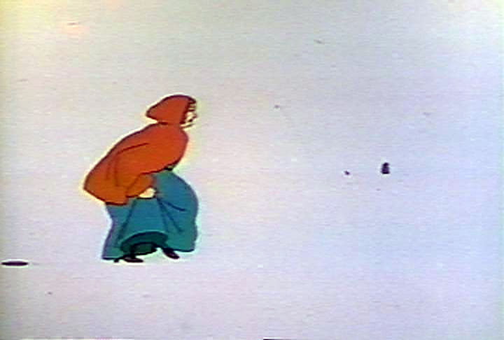
A woman walking through the snow. On twos.
This was the first project Tissa David worked on with R. O. Blechman. They would go on to have a very fruitful 20 year relationship.
She started on Columbus Day 1977. Every year I worked with her, she'd mention that. Since she had to cross the parade going down Fifth Avenue.
She also found this to be a difficult style, she confided. The lines are very hard and unexpressive. Compare to Hubley, Blechman or even Raggedy Ann and you can see what she means.
Chwast's characters demand a rigid draughting. That's something which can be very difficult for someone who excels at animating delicate characters with a light touch.
There is something particularly special about animating a sequence from Virginia Woolf's "Orlando". There's something brilliant about having Seymour Chwast design it. Something outright sublime in Tissa David animating the sequence.
I'll post the video of the whole thing in a few days, but first I'd like to look at some specific scenes.
1.
This is the second shot of the film.2.
A woman walking through the snow. On twos.
3.
Once again, apologies for image quality. This is taken from a VHS. Shockingly all the dirt is from the transfer. Something like this wouldn't get past broadcast engineers today.4.
This was the first project Tissa David worked on with R. O. Blechman. They would go on to have a very fruitful 20 year relationship.
She started on Columbus Day 1977. Every year I worked with her, she'd mention that. Since she had to cross the parade going down Fifth Avenue.
5.
She also found this to be a difficult style, she confided. The lines are very hard and unexpressive. Compare to Hubley, Blechman or even Raggedy Ann and you can see what she means.
6.
Chwast's characters demand a rigid draughting. That's something which can be very difficult for someone who excels at animating delicate characters with a light touch.
7.
Nevertheless, it's that conflict that helps breathe life into this animation. The animator pushes the character design to it's expressive limits and the design reigns in the bravado of the animator.
8.
This is a simple walk. 8 frames per stride, 16 frame full step.
9.
There's no such thing as a "standard walk cycle" every situation is different. Drawing 9 (I started this cycle on this position of the other foot - I hate when people only show 8 drawings of a 16 drawing walk) shows the balance of a woman walking in snow.
10.
She's more "down" than "up" from her passing point (drawing 7).
11.
I might have asked that she make smaller strides and have more of down emphasis on the front foot. But the drawings here keep balance. She leans forward pretty far, but never topples past her knee.
12.
The long strides and light lift make her sort of glide over the snow. This is also an effect of limited animation -animation based on cycles, pans, reused drawings and getting the most out of a pose.
13.
A few months back we saw Bakshi go all out on some walks. "Simple Gifts" was clearly operating under a different economy. To give this walk more "trudging in the snow" you'd need to add at least 4 more drawings, probably more.
As you'll see in later scenes, it would be wise to put those resources elsewhere.
14.
The details, like the hand holding the skirt, also speak to how each walk is unique.
15.
I see this scene as a great animator struggling to find the language of an idiosyncratic design under tight circumstances.
It's still a good piece of work.
16.
and a movie
Subscribe to:
Posts (Atom)