Somehow or another reading that combined with whatever other web browsing I've been up to connected me to this series of videos from the Strand with Bob and the lovely and talented R. Sikoryak.
I was there, but I'm an old man, so things like this a good reminders of what I once know.
At the beginning of this video he says "it was only about a year ago I became acquainted with [Harvey Kurtzman's] stuff". He told me the same story about ten years before. I suspect by the early 1970s R. O. had already filed away the work of every illustrator in world history and has used the following years to appreciate them all and add to the list.
This also starts with a great story about doing covers for Story magazine -an important lesson for how to be happy with your work.
Questions.
Anyone who's interested in illustration, especially students should pay close attention to this talk.
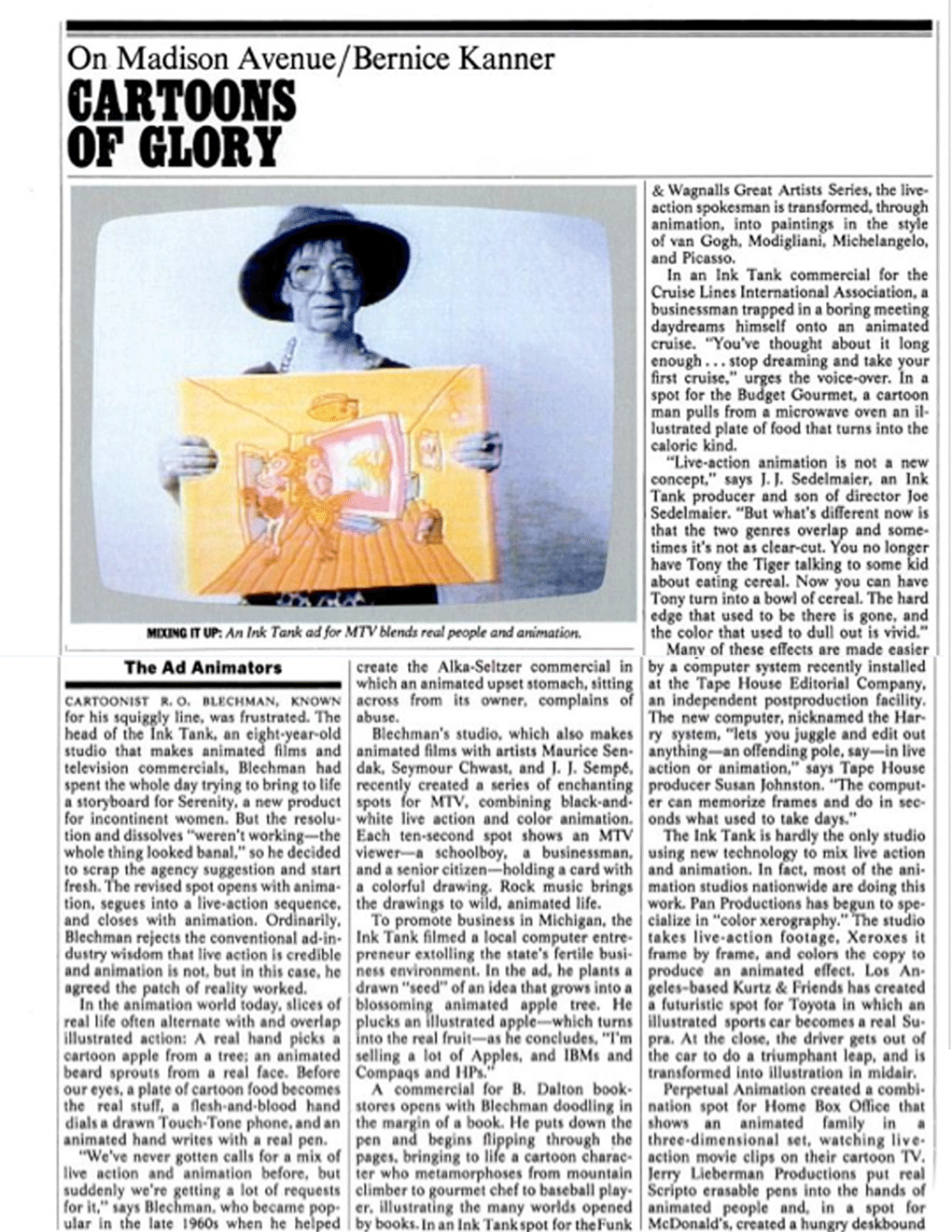
This is an article from the November 3, 1986 New York Magazine that was in The Ink Tank pressbook. I won't repost all the copy, click the images to read everything.
The photo on page one is from an MTV ID designed by Mark Marek. The actress is R. O. Blechman's mother-in-law.
Cartoonist R. O. Blechman, known for his squiggly line, was frustrated. The head of The Ink Tank, an eight year old studio that makes animated films and television commercials, Blechman had spent the whole day trying to bring to life a storyboard for Serenity, a new product for incontinent women. But the resolution and dissolves "weren't working -the whole thing looked banal," so he decided to scrap the agency suggestion and start fresh. The revised spot opens with animation, segues into a live action sequence, and closes with animation. Ordinarily, Blechman rejects the conventional ad-industry wisdom that live action is credible and animation is not, but in this case, he agreed the patch of reality worked.
The article then discusses some of the studio's spots before getting to "a computer system recently installed at the Tape House Editorial Company... The new computer, nicknamed the Harry system, 'lets you juggle and edit out anything -an offending pole, say -in live action or animation.'" That's the Paintbox system which would open a new chapter in special effects history.
Then:
Pan Productions has begun to specialize in "color xerography". The studio takes live action footage, Xeroxes it frame by frame, and colors the copy to produce an animated effect. Los Angeles based Kurtz & Friends has created a futuristic spot for Toyota in which an illustrated sports car becomes a real Supra...
Perpetual Animation created a combination spot for Home Box Office that shows an animated family in a three-dimensional set, watching live-action movie clips on their cartoon TV. Jerry Lieberman productions put real script erasable pens into the hands of animated people...
...Buzzco Associates has created a series of ads combining live action and animation: a cartoon vacuum cleaner hosing around real-life cans of Love My Carpet; real babies crying animated tears for WMET radio; an animated viewer watching live-action TV for Lifetime Cable; and a drawing of a made-up eye becoming a real eye for Aziza eye shadow...
Then Candy Kugel points out this sort of thing has been around forever but technology makes it easier.
...Nine years ago, Mark Zander Productions dropped comedian Bob Hope onto a remote oil rig operated by animated Texaco workers. More recently Zander cast an animated basset hound in a chorus line of live dancers stomping and kicking for Hush Puppies shoes, and in a spot for Shick Plus razors, planted a fuzzy white cartoon beard on the face of a real-life man. (The sudden appearance of the animated facial hair terrifies a crowd.)
Then there's some pretty banal history which tries to elevate itself by calling Walt "Walter Elias Disney".
The resurgence in commercial animation has been stimulated by advances in technology and by the work of artist like Blechman, who formed The Ink Tank in 1978 after producing an animated TV special. The Ink Tank's next project is an allegorical film The Golden Ass, which tells the story of a young man who, having been magically transformed into a donkey, struggles to regain his human form. The story recalls Blechman's award-winning TV film, The Soldier's Tale, in which a peasant soldier trades his fiddle to the Devil in return for great wealth, and find happiness only when the trade is reversed.
With big dollar advertising, Blechman feels he has made a personal Mephistophelian swap. In the sixties, he refused to advertise cigarettes, promote Muzak, or sell illustrations to Playboy. "But between these black and white poles lay a vast gray (and green!) world of commissions, and I did not know how to chart my course," he writes in his book, Behind the Lines.
Blechman has since learned. The Ink Tank is accepting more project than ever before -45 so far in 1986 -and many, like the Serenity ad, are animation-live action mixes. "Advertising is dead if it doesn't attract attention," says Blechman. "Mixing live action and animation does just that."
I used to have a few of these, but floods, vermin and other plagues did them in.
One of R. O. Blechman's original models for The Ink Tank was the Magnum Photo Agency. Replacing photographers with illustrators, he thought he could create an animation agency for the world's great print artists.
Seymour Chwast designed this poster with eight fingers -one for each artist in the stable. Blechman, Chwast, Maurice Sendak, Ronald Searle, Andre Francois, Edward Sorel, Chas. B. Slackman, and Jean-Michel Folon.
The Ink Tank evolved into a more traditional production company. I don't think Folon or Andre Francois were ever animated by the studio. Searle had some bits in a 2:00 spot for The Atlantic (I think), Slackman and Sendak only Simple Gifts. Sorel had a few commercials over the years, and Chwast has several.
http://liesjekraai.blogspot.com/We received a lot of email Christmas cards this season. Probably several dozen.
The downside is that the number of real cards is dwindling. Somewhere around 40. It's a product of a poor economy as much as anything. Even our relatively low run (500) of inexpensive cards costs around $1000 including postage.
Maybe people are reluctant to send cards in hopes of avoiding our cold card scrutiny.
In 1996 Stewart, Tabori and Chang published "The Life of Saint Nicholas" by R. O. Blechman.
It went on to be criminally underappreciated by critics, cartoonists and the book buying public in general.
It's hard to say why. Poor marketing? High price point? Or maybe the style and tone were just out of fashion -although Sarah Boxer did very well a few years later with "In the Floyd Archives," similarly smart and deceptively simple.
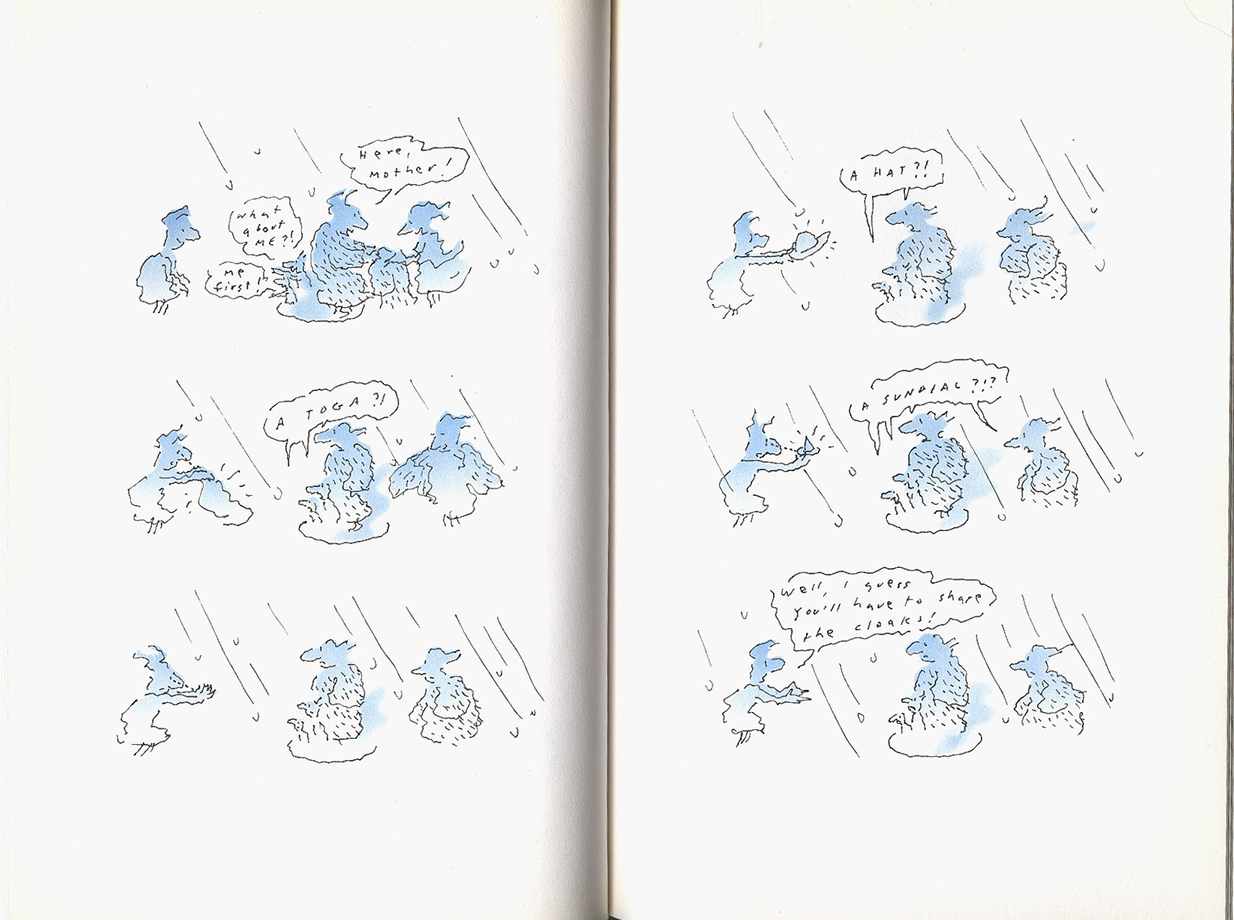
Here is one story from the book "The Miracle of the Fur-Lined Coat".
The "chapter page" is more of a title card, interrupting the beginning of the story (which will end two pages before the next "chapter page").
I love that it's a comic book without a grid pattern. The drawings live on the open page -a technique that allows for the design of the whole page to pace the story.
The coloring was done with airbrush (this was produced just after the introduction of "layers" in Photoshop). Tom Hachtman did the painting.
While I sometimes find the copy a little precious, the art and design always carry the story.
There's a cinematic quality to layout that wasn't even evident in "No Room at the Inn" (which happened to be based on a book).
Even though the art is flat, there depth is created through scale, color and layout.
The book is long out of print but copies pop up with regularity. Prices vary from $1 to $100. There was only one printing, so they're all first editions.
For years this was the artwork on the ASIFA-East membership form.
While I understand the urge to update after 30 years, I do feel the organization lost a little something going with a more generic "contemporary" design.
Again, the drawing is classic Ed Smith. Great expression. But look at the posing. It's not a stage-y silhouette. The action is clear but the gesture isn't telegraphing it. That happens in the animation.
Also, look at the line. Similar illustrators will concentrate on the "squiggly" line. The Blechman line isn't really squiggly. It's broken. It has no contour. It's even a little misshapen. The line starts and stops because every stroke is belabored.
These are qualities Ed captures without parallel.
In most films he'll animate every drawing himself -no inbetweener. He'll generally draw directly in ink. Almost always, actually.
I once asked him what he does when he's in the middle of drawing and makes a mistake. His response, "I'll let you know when it happens."
Here's the piece in it's entirety. It's a capture from an ancient VHS, so the quality is questionable.
It should also be noted with strong underscoring, that the music was composed by Arnold Black. He was a terrific guy who's delicate ear matched Ed Smith's touch on Blechman illustrations.
"No Room At The Inn" may be the crowning segment of "Simple Gifts" -no mean feat considering the strength of the others.
At the very least it represents the apex of the simple line Blechman style. After this, his long form work took a tilt towards the fantastic with "The Soldier's Tale" and a curve towards a fuller style with the stillborn films like "Bird", "The Golden Ass" and "Candide".
Before posting the full segment and further thoughts tomorrow, I wanted to highlight my favorite scene.
This film is very stage-y. It all happens along the same flat plain with some variation on shot length, but almost always playing as through a proscenium.
Ed Smith animated most of this film. Those are Ed Smith animals right there. They have an unmistakable humor to them. They're cute without being cloying. Expressive but not telegraphic. Really just great animation.
Also take note of the wind blowing. Phenomenal really.
When the schedule started to draw to a close, Ed needed some help finishing up. Tissa David took care of several scenes towards the end. I may be mistaken, but I believe this was her first time animating in the Blechman style. I can only imagine how nervous Bob must have been, he had long been unhappy with the way animators approached his art and finally found the perfect guy in Ed. Of course, any trepidation would prove groundless.
Still, the differences in their line is visible.
Above, an Ed Smith donkey.
Tissa David donkey (and sheep).
Also amazing is Ed's draughtmanship of horses. Here's an 11 drawing cycle.
I'd like to share some frame grabs of the Seymour Chwast's designs for "The Great Frost" excerpt of Virginia Woolf's "Orlando" which he created for R. O. Blechman's "Simple Gifts" in 1977.
Blechman once told me that Al Brodax was referred to him while on the hunt for a designer for the Beatles' film "Yellow Submarine".
Bob was an "edgy" illustrator at the time, if not "edgy" -iconoclastic of a new style of visual art emerging in the 1960s.
The meeting was spawned, in part, by an illustration he had done around a Beatles' song. "She Loves Me Yeah Yeah Yeah," I think. I'll have to dig around to find out.
In any event, Bob begged off the project, suggesting the producer meet with the Pushpin Group and Seymour Chwast -the undeniable giants of the new 1960s design.
Heinz Edelmann was a singular talent and tremendous designer. Had Broadax not been exposed to Pushpin during his New York talent hunt, he may not have had the vision to accept Edelmann's similar style.
Some say the Yellow Submarine aped Chwast and Glazer, that's not true and entire unfair to a great illustrator.
One thing is sure, the graphic styles are definitely kin.
It's this style which Tissa David said gave her such a hard time. The line is strict, which is difficult -you can see her loosening it here and as the film progresses the characters look more like hers and less like Chwast's.
Not just the line, though, these are flat characters. They don't have volume. This makes moving them in space (and retaining the design's integrity) particularly tricky.
This film is limited animation. So the sumptuousness of the design is important to carry much of the story.
Before posting the entire film, I'm thinking of posting an interesting scene in which we see Orlando think. Again, limited animation, but the drawings come together in a special way.
There's also some dancing which is worth taking note of.
The next segment in R. O. Blechman's "Simple Gifts" is "Lost and Found" using Fontaine Fox's classic Toonerville Trolley characters.
This was animated by Bill Littlejohn. The great animator left us earlier this year. I don't think I ever spoke with him, but we've always sent him a Christmas card. He surely had no idea where it was coming from.
It's a sad time of year, crossing names off of Santa's list.
The film is very limited animation -but done in a stylized way you rarely see anymore.
This run, for instance, is a four drawing cycle.
Up, down, up, down.
With the panning background, those are all the drawings needed.
No mistaking it, Christmas is being flung in our faces at every opportunity. Every shop window, every magazine ad, channel to channel on the dial.
As a respite from the grossness of the holiday, I thought I'd post some segments from R. O. Blechman's 1977 special "Simple Gifts."
It's literate and elegant and full of wit and emotion in ways current "product" doesn't even attempt to approach.
This first story is taken from Moss Hart's "Act One".
This book, in itself, is essential reading for anybody in "show business".
This is digitized from a VHS, so the usual apologies for image and audio quality.
I don't know too much about the production of this particular piece -Michael Sporn was producer and assistant director for R. O. at the time so he probably has some insight. That's a position which requires a range of skill and a lot attention.
EDIT: In the comments section Michael attributes the piece to Phillip Schopper (who R. O. would still call on for editor recommendations 20 years later).
R. O. would give a degree of autonomy to artists whom he trusted -in the other segments of this show will see different results for this creative leeway. Interesting how through all the different styles represented in this show, they all retain that signature intelligence we know from Blechman's work.
From 1971 to 1976 he worked with Al Brodax as animation producer for the ABC Sunday morning show "Make A Wish". Songwriter Tom Chapin hosted. Each episode was a montage on a theme like "flying" or "bulls". Mogubgub hired young animators, many still in school, to create animation.
At the end of the first season of "Make A Wish", he made his last short film, American Pie. There are at least two versions of this film. The earlier version one shot of man riding a motorcycle. Mogubgub animated directly on the negative around him. The last version is a masterful reading of Don McLean's song incorporating the man on the motorcycle, some original animation, and bits from "Make A Wish". This screened as a short in the New York Film Festival.
Still from "American Pie"
Sick of commercial work in the late 1970s, Mogubgub focused on painting. At first glance his painting couldn't appear more removed from his films. the films are frenetic and seemingly scattered, whereas the paintings are detailed and painstakingly rendered. "Virginia's Garden" was a 25 x 30 foot canvas covered with fruits and vegetables, portraits and buildings. With all the multilayering and detail the artist can barely fit everything. If each frame of Enter Hamlet were put on a wall, what emerges might look an awful lot like "Virginia's Garden" -a sprawling interpretation of the world, struggling to fit within the confines of a single piece of art.
His painting jumped from portraiture to abstraction and back. He created a series of "Spirit" paintings. The otherworldly portraits are interpretations of nighttime spectral manifestations. He experienced visitations. Once he met 18th Century Christian mystic Immanuel Swedenborg in a phone booth outside Grand Central Station. This was one of several encounters with the cosmic theorist.
In the 80s he continued painting while freelancing as an animator. He animated several commercials for his old friend Vincent Caffarelli at Buzzco including spots for cigars and "Bit O Honey".
Still from R. O. Blechman's "L'Histoire du Soldat"
His last film collaboration was with R. O. Blechman on The Ink Tank's production of Stravinsky's L'Histoire du Soldat. Mogubgub's sequences are pure magic. His animation moves from shapes exploding in space to dramatic silhouettes and multiscreen sequences. The contraposition of his raw graphic fantasies with the powerful character animation of Ed Smith and Tissa David helped the film win the first ever Emmy Award for Outstanding Achievement in Animation.
Upon completion of his work on L'Histoire du Soldat, Mogubgub again concentrated on painting. His painting began to take the form of the geometric abstractions he created for the Stravinsky film. He spoke of shapes spinning into infinity as though geometry and motion were twin forces keeping the universe whole.
He died in his home in Cliffside Park, NJ on March 9, 1989. He was taken by bone cancer at 61
I was recently reminded of R. O. Blechman's "Book of Jonah".
Published in 1997 by Stewart Tabori and Chang as part of three book deal which included a reissue of "The Juggler of Our Lady" and the new title "The Life of Saint Nicholas", "Jonah" was sadly neglected.
In my opinion, it's not only Blechman's greatest work -it's amongst the top illustrated books of all time: comic books, graphic novels, or children's books.
You see his timing and perception of space in these few pages.
The images tell the story. It's practically Ernie Bushmiller in it's graphic essence. The words are punctuation.
The above sequence harkens back to "The Juggler of Our Lady". The drawings here are better, of course, beyond that the progression of the images -full scale to single line evokes fear and abandonment better than 1000 words could.
Timing, the space between the drawings, is finely tuned here. The differences in Jonah's poses are weighted by the space around him and the progression through the pages.
At times the scale transforms and images devour entire spreads.
The color is as precise as the line is tenuous. Tom Hachtman did the airbrushing on the original artwork. R. O. is specific on the tones and application of the color. Just like the line, it's deceptive simplicity belies a rewarding sophistication.