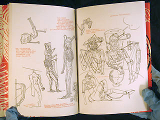
Here's the next couple steps for the motion graphics illustration of the "The Dove".
After typing the script, reading it a few dozen times and listening to it just as many we did a thumbnail, sketchbook storyboard.
This is a good way to start figuring out what's going to happen.
It's a simple starting point.
This very rough board was transferred into a less rough board.
Since this is graphics, the board doesn't necessarily need to be as precise as a "cinematic" film.
The board can be pretty diagrammatic.
Next, we'll do a rough pass on the animation.
Showing posts with label motion graphics. Show all posts
Friday, April 8, 2011
Thursday, April 7, 2011
Collaging A Collage
We've been contracted to do the graphic for the NEH/PBS initiative "Picturing America".
This has mostly been the title sequence and typesetting with a couple other things here and there. That's in addition to the handful of full subjects we've produced.
Last week we began discussing with Gail Levin a way to illustrate the construction of Romare Bearden's "The Dove". The impetus behind this idea was the voice track of his niece describing the artist's thought process.
We thought it would be interesting to document the process as we go along.
Today we got the audio cut.
Step One: Listen to the voice over a few times.
Step Two: Type the transcript.
Step Three: Verbally run our idea by Gail.
This little bit is deceptively difficult. When it's complete it should easy and obvious, but getting there might be tricky.
The primary concern in creating illustrative graphics about art is to be "true to the subject." At least in these educational films. Reverence is appropriate.
What is difficult here is that we'll need to show the construction of the collage without the benefit of pulling apart the layers from the original.
Our next step will be to sketch a rough concept board.
This has mostly been the title sequence and typesetting with a couple other things here and there. That's in addition to the handful of full subjects we've produced.
Last week we began discussing with Gail Levin a way to illustrate the construction of Romare Bearden's "The Dove". The impetus behind this idea was the voice track of his niece describing the artist's thought process.
We thought it would be interesting to document the process as we go along.
Today we got the audio cut.
Step One: Listen to the voice over a few times.
Step Two: Type the transcript.
Step Three: Verbally run our idea by Gail.
This little bit is deceptively difficult. When it's complete it should easy and obvious, but getting there might be tricky.
The primary concern in creating illustrative graphics about art is to be "true to the subject." At least in these educational films. Reverence is appropriate.
What is difficult here is that we'll need to show the construction of the collage without the benefit of pulling apart the layers from the original.
Our next step will be to sketch a rough concept board.
Monday, March 14, 2011
Monday Morning Motion Graphics: Pictures of Pictures
These are two clips from a sequence we did for Gail Levin's American Masters' Jeff Bridges: The Dude Abides.
Since Starman, Jeff Bridges has chronicled the production of all his films with his widelux camera. He then prints a small run of books as wrap gifts to cast and crew.
Presenting photography in documentary can present a tough issue. Showcasing the image is the primary task, so you want to respect the image, intent and cultural context of the picture.
In this case presentation is made even more difficult by the ultra-wide format of the camera.
So we decided to show the books instead of creating a digital graphic presentation.
The idea was to evoke an intimate, personal feeling with the books. The photographer has an unusually personal relationship to the subjects, so we felt as though the "hand" should feel present here too.
So we shot a test in a couple hours, it was probably about three minutes long. A few days later, Jed Parker, the film's editor, trimmed it to the length they needed. We then reshot to match that length.
Friday, January 14, 2011
Pan And Scan
The most rudimentary work animators have traditionally been called upon to produce is "pan and scan" of photos and artwork.
It's the simplest form of motion graphics, like motion graphics you use non-consecutive images sequenced to present an idea.
It's also an opportunity to put the Kulechov Effect to work.
Here's a sequence for the Jeff Bridges documentary.
We were basically given the soundtrack. The editor had slugged images which weren't usable for various reasons (many were repeats or just inappropriate) and only approximated the cuts.
We had to go through the photo archive and find the best images for the sequence.
It's making a little film with the barest resources.
I find motion graphics sequences like this oddly rewarding, maybe how a magician feels when he pulls a rabbit out of someone else's hat.
It's the simplest form of motion graphics, like motion graphics you use non-consecutive images sequenced to present an idea.
It's also an opportunity to put the Kulechov Effect to work.
Here's a sequence for the Jeff Bridges documentary.
We were basically given the soundtrack. The editor had slugged images which weren't usable for various reasons (many were repeats or just inappropriate) and only approximated the cuts.
We had to go through the photo archive and find the best images for the sequence.
It's making a little film with the barest resources.
I find motion graphics sequences like this oddly rewarding, maybe how a magician feels when he pulls a rabbit out of someone else's hat.
Monday, December 27, 2010
Last of Xmas
So this is the last of the Christmas related posts.
I'm not really into Christmas, honestly. So it was a great pleasure to get the call from Morgan Spurlock's production company a few years back to create some graphics for Rob VanAlkemede's "What Would Jesus Buy?"
The structure of the film changed towards the end of production and our sequences were cut, but it was still a great experience.
We don't do too much in the way of 3D graphics -maybe one or two projects a year. This was animated by Phil McNagny.
I'm not really into Christmas, honestly. So it was a great pleasure to get the call from Morgan Spurlock's production company a few years back to create some graphics for Rob VanAlkemede's "What Would Jesus Buy?"
The structure of the film changed towards the end of production and our sequences were cut, but it was still a great experience.
We don't do too much in the way of 3D graphics -maybe one or two projects a year. This was animated by Phil McNagny.
Monday, November 8, 2010
Monday Morning Station ID
When Sesame Workshop and Nickelodeon first started up Noggin about 10 years ago, they contacted several production companies to pitch station IDs.
We came up with probably about a dozen ideas at The Ink Tank, this is the one they chose to produce.
It's conceived and directed by one of my favorite people in the world, Alex Reshanov, who also did all the AfterEffects animation.
We came up with probably about a dozen ideas at The Ink Tank, this is the one they chose to produce.
It's conceived and directed by one of my favorite people in the world, Alex Reshanov, who also did all the AfterEffects animation.
Monday, September 13, 2010
Monday Morning Motion Graphics
Not only did we create the titles and an animated sequence for Gail Levin's documentary on Cab Calloway the film was edited by Pascal Akkesson at our studio.
This proximity not only allows for close collaboration, it gives the possibility for quick fixes.
The European broadcasters needed a visual bridge to insert some narration. We were given a couple pieces of art and asked to make something work.
It's by no means brilliant, but a simple sequence which filled a gap in the film.
This proximity not only allows for close collaboration, it gives the possibility for quick fixes.
The European broadcasters needed a visual bridge to insert some narration. We were given a couple pieces of art and asked to make something work.
It's by no means brilliant, but a simple sequence which filled a gap in the film.
Monday, March 1, 2010
Border Pass
This may never be useful to anyone else, but here's a little After Effects trick for making a border around a frame.
Click the shape tool. Set the stroke to 2 pixels for a one pixel border -if you only do one pixel it's soft and grey.
Make the shape white.
Then click the layers window. This will make a shape the size of the document.
Set the "mode" to multiply.
This gives you an exact, perfect border.
Wednesday, February 10, 2010
Saul Bass Titles For John Frankenheimer's "Seconds"
There's little left to say about Saul Bass. He's one of the few graphic artists in film who's work has been well documented -not to the smothering extent of the Disney big shots but more than say, Pablo Ferro or Jim Tyer.
Every word of praise is deserved. He was an unparalleled talent.
If I had to make a short list of filmmakers to study under, Saul Bass would be near the top.
These are frame grabs from "Seconds". I've grabbed approximately one every 30 video frames. It reads left to right, then down.
Click to enlarge any page.
Director credit. Resolve on scene one.
A little bit of brilliance.
Every word of praise is deserved. He was an unparalleled talent.
If I had to make a short list of filmmakers to study under, Saul Bass would be near the top.
These are frame grabs from "Seconds". I've grabbed approximately one every 30 video frames. It reads left to right, then down.
Click to enlarge any page.
Extreme close ups distort from one to the next. I'm guessing this was done with an optical printer, but must have been in camera.
The sculpting of the face (in live action) is graphic shorthand for the narrative of the film.
The title sequence, in essence, tells us what the movie is without coming right out and saying it.
The process used in this sequence is the perfect choice for poetically presenting the theme of the film.
The film is a "psychological thriller", but this sequence is the only truly spine-tingling part.
Director credit. Resolve on scene one.
A little bit of brilliance.
Friday, February 5, 2010
Motion Graphics
One of the difficulties of design is that sometimes there's only one right answer, but usually there are dozens.
Concepts can get worked over endlessly in a quixotic quest to make it "perfect", thinking that this is that time when there's just a single solution.
We did some graphics for a documentary Gail Levin produced a few years ago. The working title was "A is for...", the final title was "Two Worlds One Planet". I'm reminded of as she's editing a new film at our place and we were just discussing the graphics.
It was a case of trying a bunch of things and seeing what worked best.
We did about seven, here are my favorite three.
Concepts can get worked over endlessly in a quixotic quest to make it "perfect", thinking that this is that time when there's just a single solution.
We did some graphics for a documentary Gail Levin produced a few years ago. The working title was "A is for...", the final title was "Two Worlds One Planet". I'm reminded of as she's editing a new film at our place and we were just discussing the graphics.
It was a case of trying a bunch of things and seeing what worked best.
We did about seven, here are my favorite three.
Sunday, January 3, 2010
Mystery?
Everything needs an update, right?
Who needs musty old stuff when it can be revamped into whooshy new graphics?
A few years back PBS repackaged its venerable Mystery! series into its parent Masterpiece Theater. This is, of course, indicative of PBS's cluelessness. It's not the packaging that's dated -people love the packaging. Even the form -if literate, intelligent programming was anathema then HBO, Showtime, and the entire boon in television writing would've been stillborn before The Sopranos ever tweeted.
Knowing the shame, it seems like PBS has not put the newer title sequence online.
Fortunately, the unadulterated Derek Lamb produced Ed Gorey titles survive.
These are a great example of "suitable" animation. I mean that as a high, high compliment. The posing, the gestures, the motion all fit the illustration style.
You often see illustration treated inappropriately in animation. These titles are ideal. Shame they've been bastardized in an attempt to make them more "appealing" to the "modern" viewer.
Who needs musty old stuff when it can be revamped into whooshy new graphics?
A few years back PBS repackaged its venerable Mystery! series into its parent Masterpiece Theater. This is, of course, indicative of PBS's cluelessness. It's not the packaging that's dated -people love the packaging. Even the form -if literate, intelligent programming was anathema then HBO, Showtime, and the entire boon in television writing would've been stillborn before The Sopranos ever tweeted.
Knowing the shame, it seems like PBS has not put the newer title sequence online.
Fortunately, the unadulterated Derek Lamb produced Ed Gorey titles survive.
These are a great example of "suitable" animation. I mean that as a high, high compliment. The posing, the gestures, the motion all fit the illustration style.
You often see illustration treated inappropriately in animation. These titles are ideal. Shame they've been bastardized in an attempt to make them more "appealing" to the "modern" viewer.
Sunday, December 13, 2009
They Call Me Energy
One of our favorite projects to date remains WNET/Thirteen's "Curious".
Gail Levin introduced us to Mark Mannucci while we were working together on the pilot for Little Pim. A few months later his producer, Tara Thomas, sent us an email to see if we were interested in working on their science show.
The first assignment was to design an "artificial leaf", or the graphic explanation of it anyway.
The trick with science pieces is to be both accurately informative and at the same time clear enough that a layperson can understand. I'll mention that beautiful design is paramount, but feel as though that should go without saying.
Here is one of our initial design studies with a variation.
See the final segment here. It ultimately turned out very differently, but the tactile look of the graphics remains intact.
Gail Levin introduced us to Mark Mannucci while we were working together on the pilot for Little Pim. A few months later his producer, Tara Thomas, sent us an email to see if we were interested in working on their science show.
The first assignment was to design an "artificial leaf", or the graphic explanation of it anyway.
The trick with science pieces is to be both accurately informative and at the same time clear enough that a layperson can understand. I'll mention that beautiful design is paramount, but feel as though that should go without saying.
Here is one of our initial design studies with a variation.
See the final segment here. It ultimately turned out very differently, but the tactile look of the graphics remains intact.
Friday, December 11, 2009
Lower Thirds
Doing a lot of documentary work -graphics, animation, editorial -means we've had to deal with "lower thirds" more than any sane would care to.
Wednesday I spent most of the day dealing with this on three projects.
One was a one-day job.
Elliot Cowan did the design on this. I just knocked out the versions (right/left, different names).
That's not actually the Health Secretary.
That was fairly straightforward. News broadcast, tight deadline.
The lower thirds for The Buddha are more complicated.
First we're designing and drawing the lettering. There are about a dozen total.
The white is the full HD broadcast. The light pink is full NTSC raster, medium pink is "action" safety, dark pink is title safety.
So when the lower third is placed into NTSC title safety, this is what we get (and keep in mind, this is the most visually pleasing example).
Wednesday I spent most of the day dealing with this on three projects.
One was a one-day job.
Elliot Cowan did the design on this. I just knocked out the versions (right/left, different names).
That's not actually the Health Secretary.
That was fairly straightforward. News broadcast, tight deadline.
The lower thirds for The Buddha are more complicated.
First we're designing and drawing the lettering. There are about a dozen total.
The bigger issue is the "cut off".
The film is produced in High Definition, 16x9. The above layout fits the safeties.
The distributors want the titling to ALSO fit within NTSC 4:3 title safety since some broadcast affiliates might just "center crop" instead of letterboxing. Needless to say... "ugh" (on so many levels).
Here's the difference:
The white is the full HD broadcast. The light pink is full NTSC raster, medium pink is "action" safety, dark pink is title safety.
So when the lower third is placed into NTSC title safety, this is what we get (and keep in mind, this is the most visually pleasing example).
Tuesday, July 7, 2009
Dream
Thursday, June 25, 2009
Repeat Business
Getting a job is difficult. Even if you've got a great reel, competitive pricing, and a good creative strategy there are a slew of things that can prevent you from landing the client.
Sometimes the job just disappears, sometimes someone else is just as good, sometimes (and this happened to Brian while at The Ink Tank) the ultimate decision-maker is an anti-Semite and won't go to New York because its "full of Jews".
Sometimes the prospective client already has a relationship with a vendor they trust. This happens frequently.

That's why it's important to become that trusted vendor.
Last year we had 20 contracts (that's four shorter than quota, but some were multi-film deals). 10 were people who had contracted Asterisk previously, an additional two were with clients Brian has known for over 20 years, four were on recommendation from Gail Levin. Add it up, that's 80% of our work that comes from personal relationships.

Showing right now in Las Vegas are some graphics we did for TMG Communications, old friends we haven't heard from in 4 years. We like them a lot and we're proud of this simple little motion graphics pieces we did.
Natella Kataev is largely responsible for these. Above is one of five clips we created for a trade show. If you like it, it's Natella's doing. If not, that's probably my fault.
Sometimes the job just disappears, sometimes someone else is just as good, sometimes (and this happened to Brian while at The Ink Tank) the ultimate decision-maker is an anti-Semite and won't go to New York because its "full of Jews".
Sometimes the prospective client already has a relationship with a vendor they trust. This happens frequently.

That's why it's important to become that trusted vendor.
Last year we had 20 contracts (that's four shorter than quota, but some were multi-film deals). 10 were people who had contracted Asterisk previously, an additional two were with clients Brian has known for over 20 years, four were on recommendation from Gail Levin. Add it up, that's 80% of our work that comes from personal relationships.

Showing right now in Las Vegas are some graphics we did for TMG Communications, old friends we haven't heard from in 4 years. We like them a lot and we're proud of this simple little motion graphics pieces we did.
Natella Kataev is largely responsible for these. Above is one of five clips we created for a trade show. If you like it, it's Natella's doing. If not, that's probably my fault.
Wednesday, May 20, 2009
On With The Showtime
Nursery University began airing on Showtime last night.

It's "on demand" until June 8 and has at least 4 more airings including tonight:
5/20/09 @ 7:00 PM
5/22/09 @ 6:30 PM
5/23/09 @ 9:30 AM
5/24/09 @ 5:30 PM
The official website has links to a bunch of reviews and interviews. (When are they going to interview the graphics directors, huh?)
Personal bias aside, I think it's a sensitive portrait of disparate families who find themselves in a ridiculous situation. Sure, it's foolish to hustle so hard for half a day of finger painting but, ultimately, these parents are all afraid to fail their children. They refuse to relinquish the greater part of the American Dream -to give your children a better life than you had.
Here's another graphic bit:

It's "on demand" until June 8 and has at least 4 more airings including tonight:
5/20/09 @ 7:00 PM
5/22/09 @ 6:30 PM
5/23/09 @ 9:30 AM
5/24/09 @ 5:30 PM
The official website has links to a bunch of reviews and interviews. (When are they going to interview the graphics directors, huh?)
Personal bias aside, I think it's a sensitive portrait of disparate families who find themselves in a ridiculous situation. Sure, it's foolish to hustle so hard for half a day of finger painting but, ultimately, these parents are all afraid to fail their children. They refuse to relinquish the greater part of the American Dream -to give your children a better life than you had.
Here's another graphic bit:
Wednesday, May 13, 2009
Get Happy
Yesterday was the last class of the semester.
One of the many unappreciated poeticisms of the syllabus -we end with a class on title design (which includes a bit on end credits).
This year I pulled up the opening titles to "The Partridge Family" after screening the titles to "Blacula". Both were designed by Sandy Dvore.
TV titles are usually pretty stingy budgets. There are two points of interest to this piece. Two things that make it good design.
First is obvious. The economy. The animation is simple, clear and based on repeat action with color variation.
The second is narrative and a little subtle. All of the "family" are introduced in the same way -through the little birds: the manager, Ruben, is introduced in a different manner. This also allows for the transition to the live action bus at the end. A story is being told through the gesture of the graphics.
Wednesday, May 6, 2009
Fuel
This is a little special effects clip we did for Thirteen/WNET's "Curious" mini-series last summer.
The characters (people) were shot on DV and chromakeyed. The lightbulb we photographed against white and digitally rebuilt it.
Thursday, April 30, 2009
Springtime For Igor
Some people are so extraordinary that anything they do will amaze in an unexpected way.
Jonathan Rosen's work may first catch your eye for its gritty line work and dystopian appendages -men and women bound and tethered, limbs exchanged for mechanical parts.

Jesse Gordon once asked the mild manner artist why he drew so many characters with things sticking out of them. The response: it came from when he first saw someone using a Walkman.
Now that we've changed seasons, here's a little motion graphics loop, "Springtime For Igor" Jonathan created from a day in the Brooklyn Botanical Gardens.
Jonathan Rosen's work may first catch your eye for its gritty line work and dystopian appendages -men and women bound and tethered, limbs exchanged for mechanical parts.
Jesse Gordon once asked the mild manner artist why he drew so many characters with things sticking out of them. The response: it came from when he first saw someone using a Walkman.
Now that we've changed seasons, here's a little motion graphics loop, "Springtime For Igor" Jonathan created from a day in the Brooklyn Botanical Gardens.
Wednesday, April 29, 2009
Motion Pictures
Gail Levin, with whom we regularly collaborate, made "Marilyn: A Still Life" for American Masters a few years back.
Here's a segment on the actress' sessions with Milton Greene
Just before the two minute mark we're shown photos from the "Black Velvet" sitting.
Ordinarily, this would be motion graphics -panning and scanning over photos. Not here. The photos were tacked onto a wall and filmed with a handheld Super 8 camera.
The result is loose and sensuous. The camera moves over the images just as your eye might, going in and out of focus- staring, moving with fits and starts.
Here's a segment on the actress' sessions with Milton Greene
Just before the two minute mark we're shown photos from the "Black Velvet" sitting.
Ordinarily, this would be motion graphics -panning and scanning over photos. Not here. The photos were tacked onto a wall and filmed with a handheld Super 8 camera.
The result is loose and sensuous. The camera moves over the images just as your eye might, going in and out of focus- staring, moving with fits and starts.
Subscribe to:
Posts (Atom)